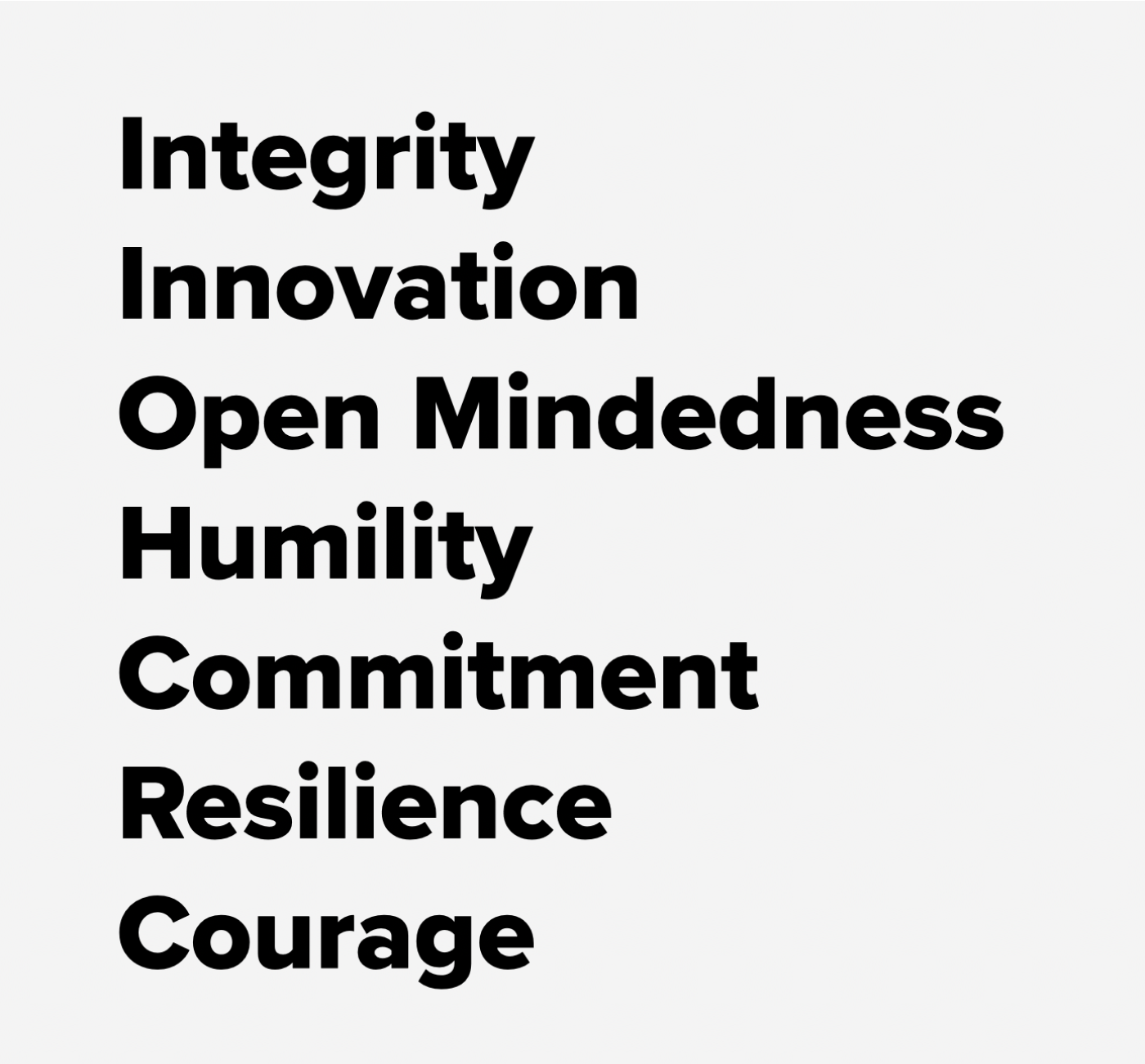
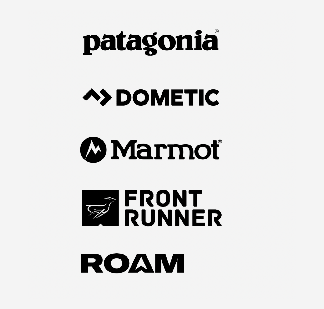
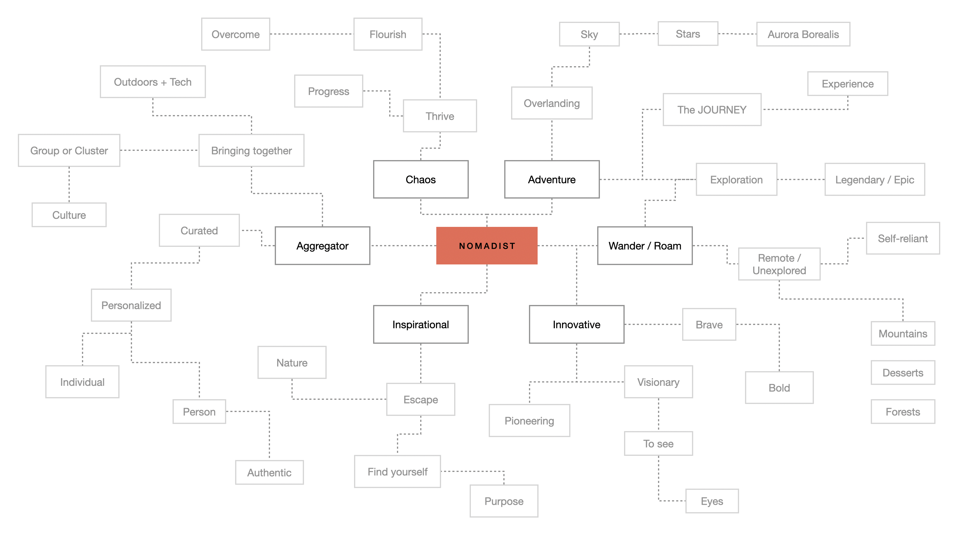
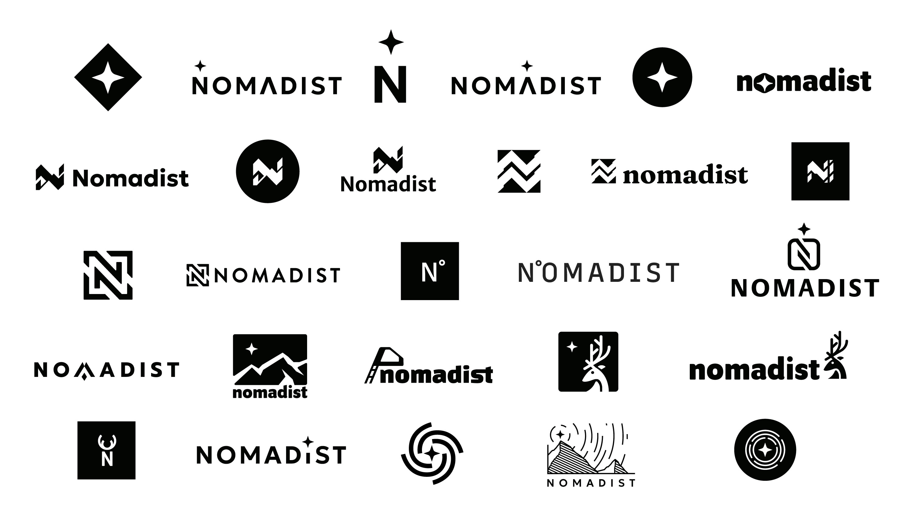
The goal was to position Nomadist as the platform for people who take overlanding seriously, one that could stand alongside the brands they were building relationships with. We opened with a values exercise to define what the brand needed to carry, moved into mind-mapping to surface visual symbols for those values, then took the strongest ideas into concepting.
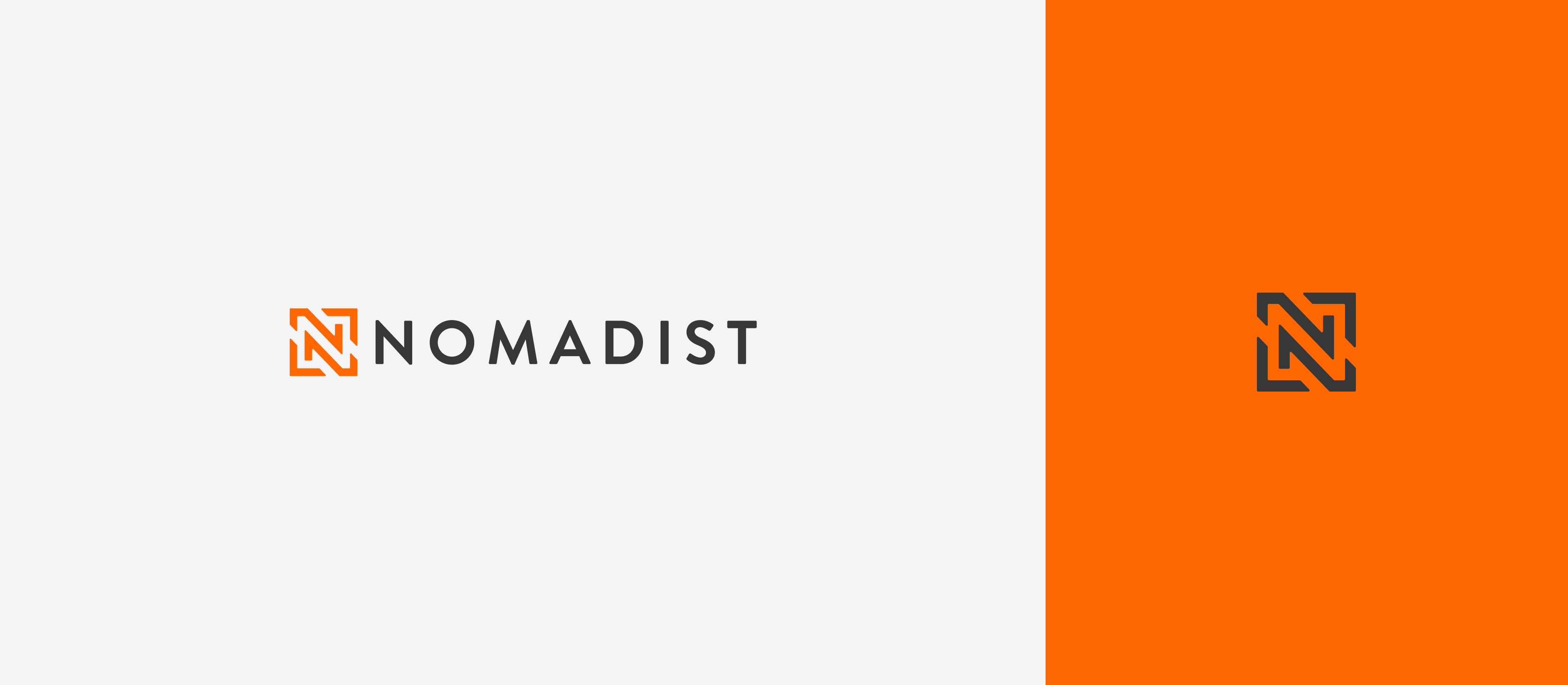
This logo is based on the concept of tire tread impressions left behind as we leave the confines of routine, embrace the call of adventure and leave our mark, not only on the trails we tread but also on the landscape of our soul.
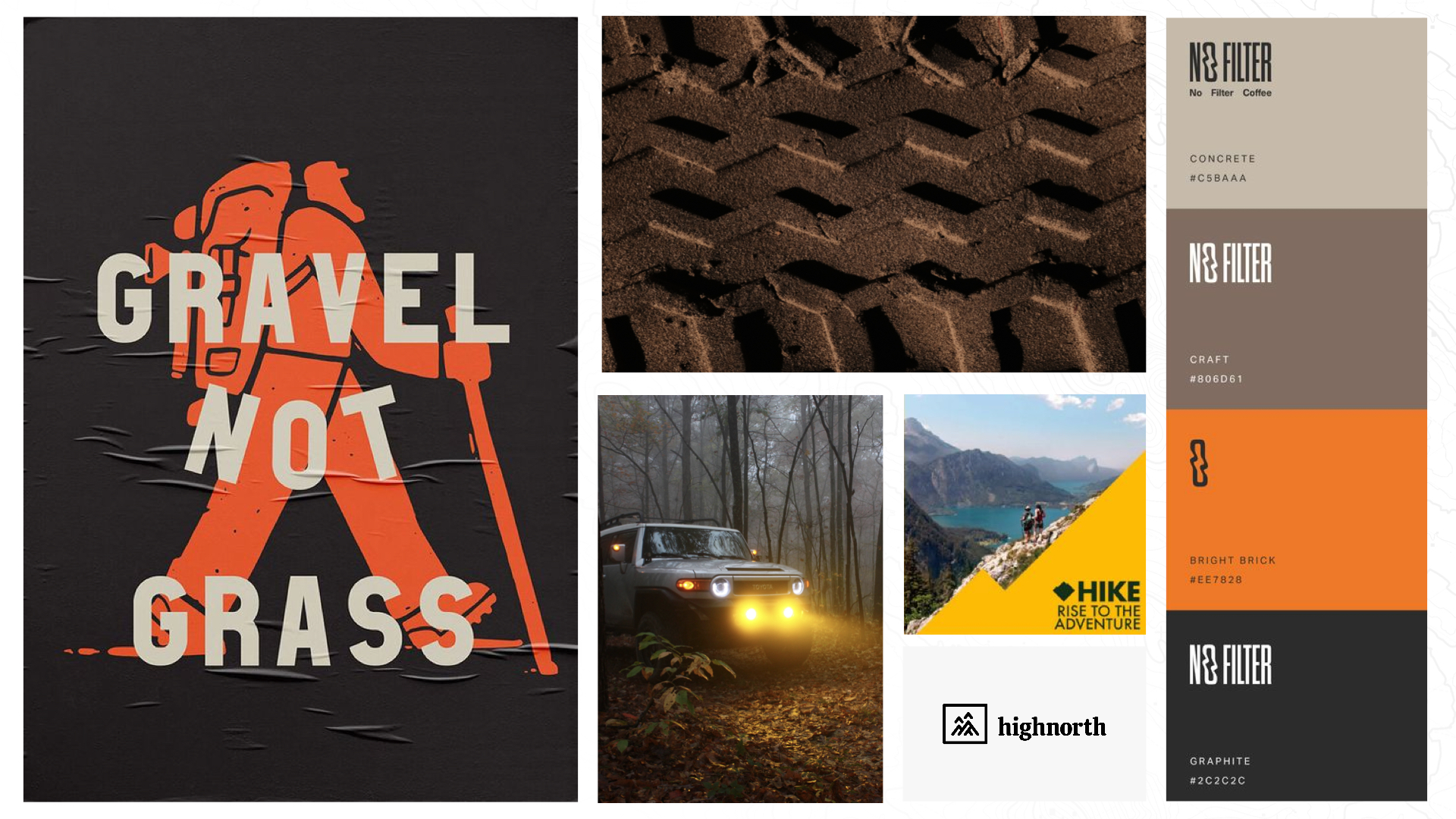

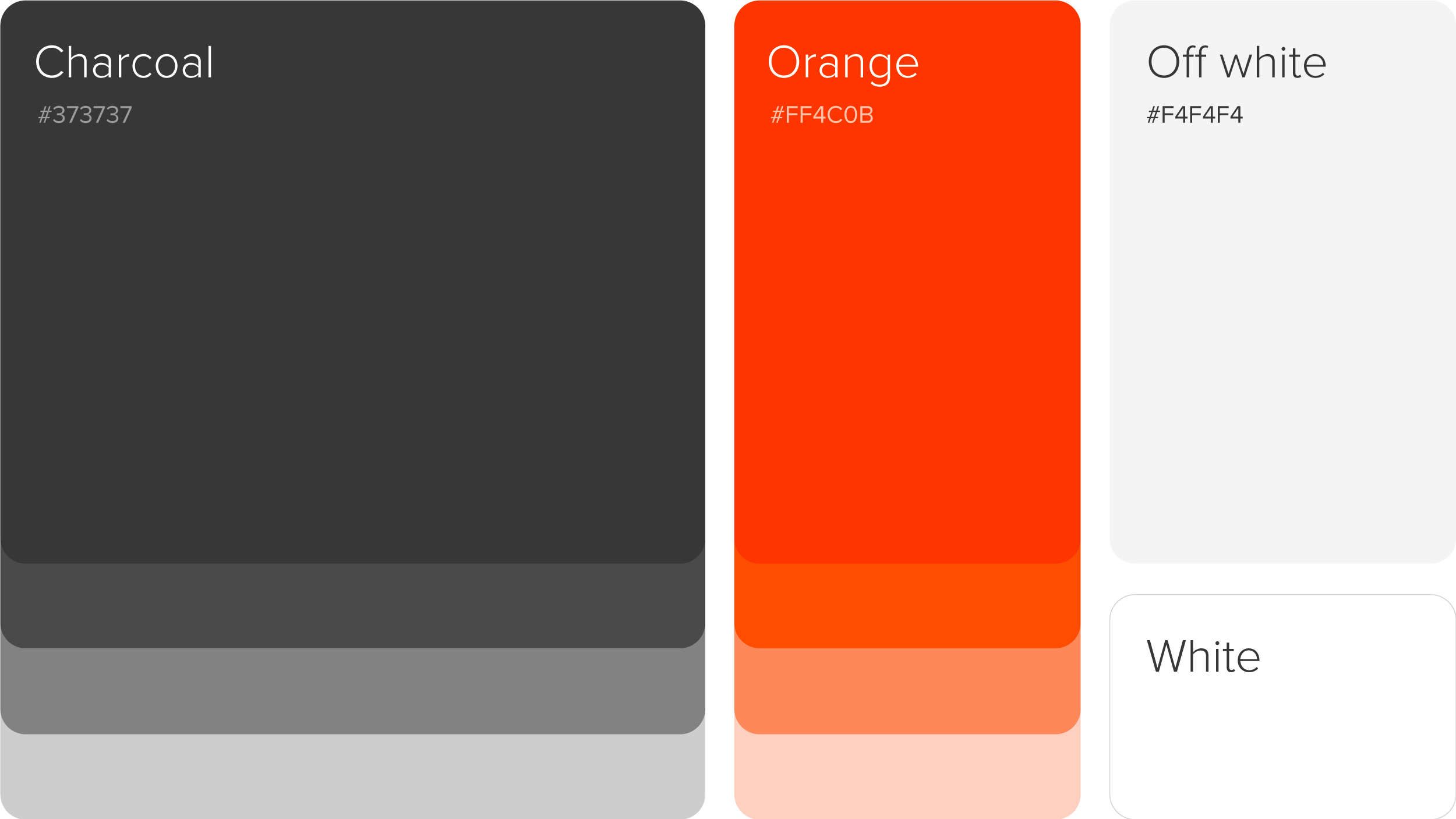
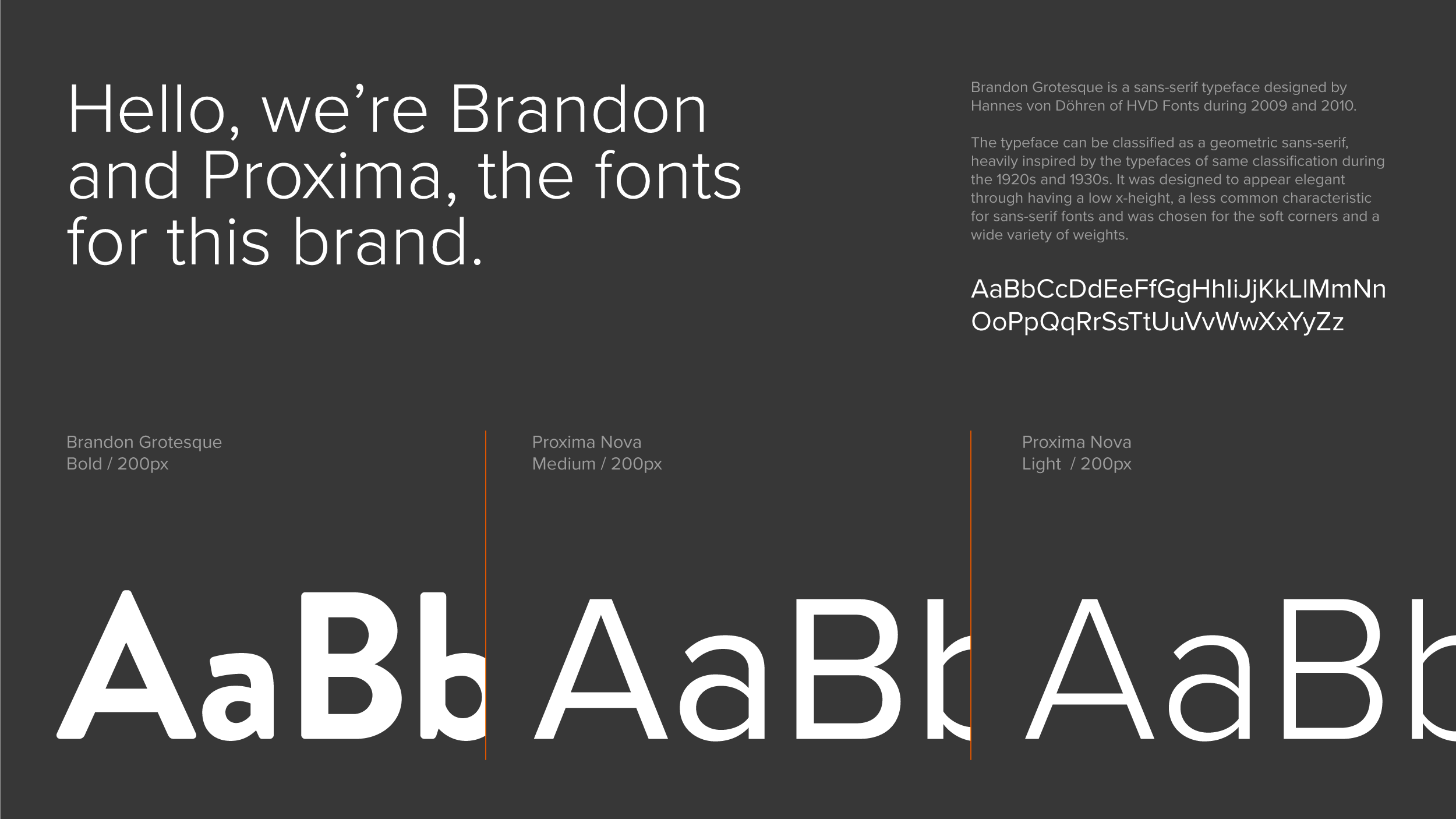
The palette draws from terrain and sky: earth tones anchored by a near-black, with one warm accent that carries the brand's energy. Typography pairs a geometric sans for headlines with a straightforward workhorse for body copy. The icon set follows the same node logic as the logomark: clean strokes, consistent weight, readable at small sizes.

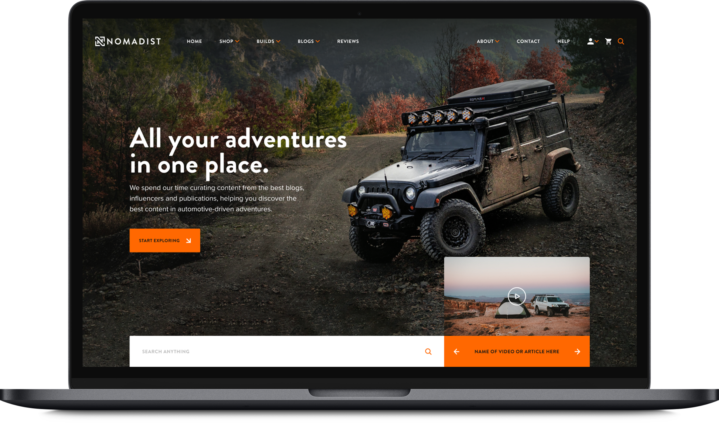
Across apparel, social, and digital, the system held together. The logomark reads at small sizes and doesn't shrink at large ones. The palette and type work on dark and light backgrounds alike, which matters for a brand that lives on social, in print, and on actual gear.