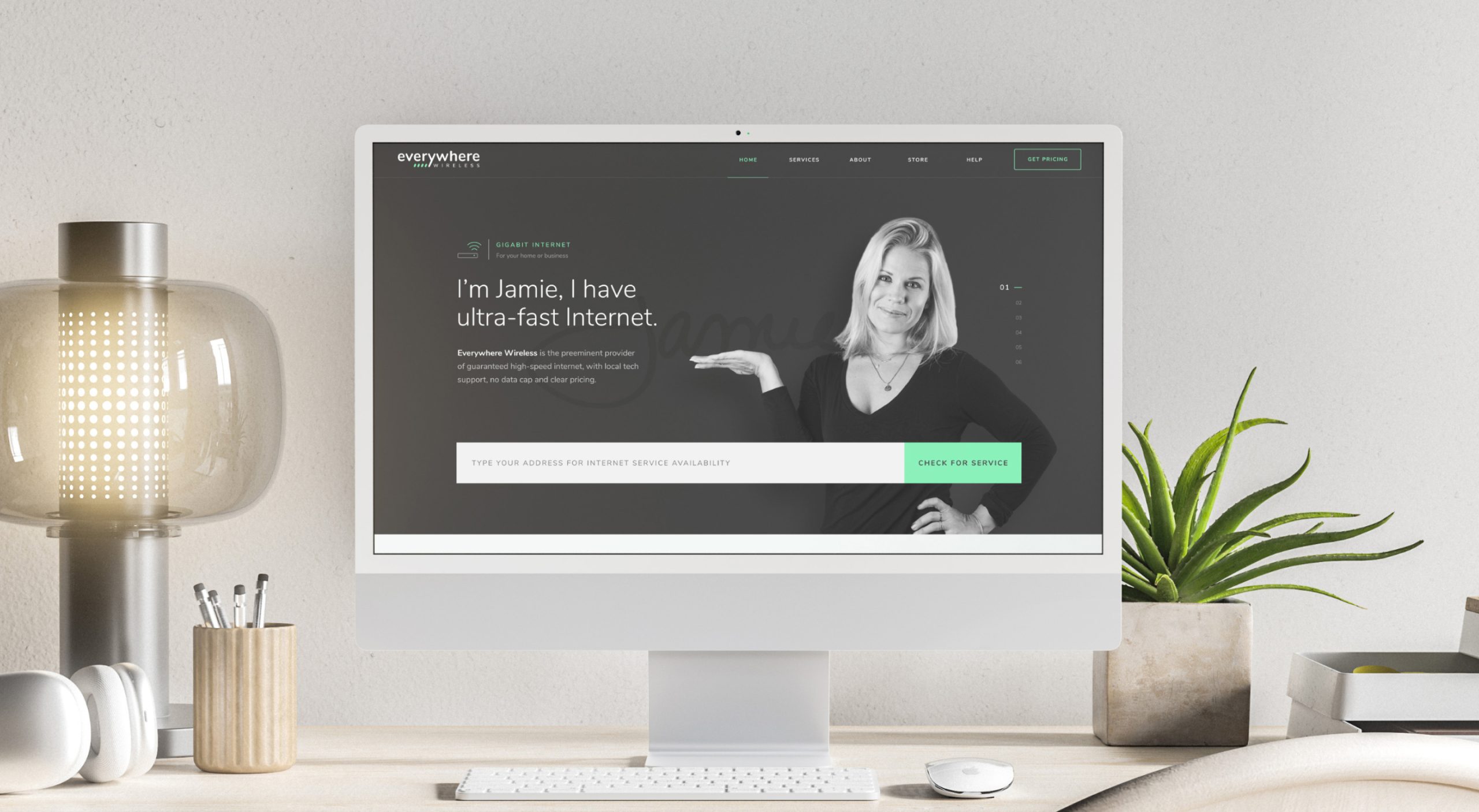
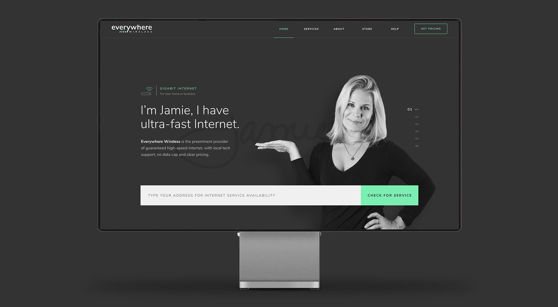
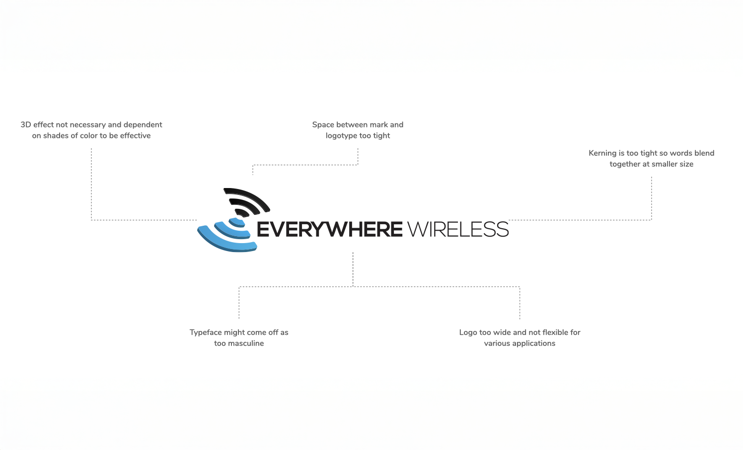
EW came in with a strong product and no visual identity to show for it. The existing brand wasn't communicating the craft behind what they were building, and the website wasn't converting the interest they were generating.
The brief was clear: build a brand worth standing behind and an online store built to sell, starting from the mark and carrying it all the way through to checkout.

A mind-mapping session surfaced visual symbols and associations that aligned with how the team wanted to be perceived, and just as importantly, clarified what to leave out.

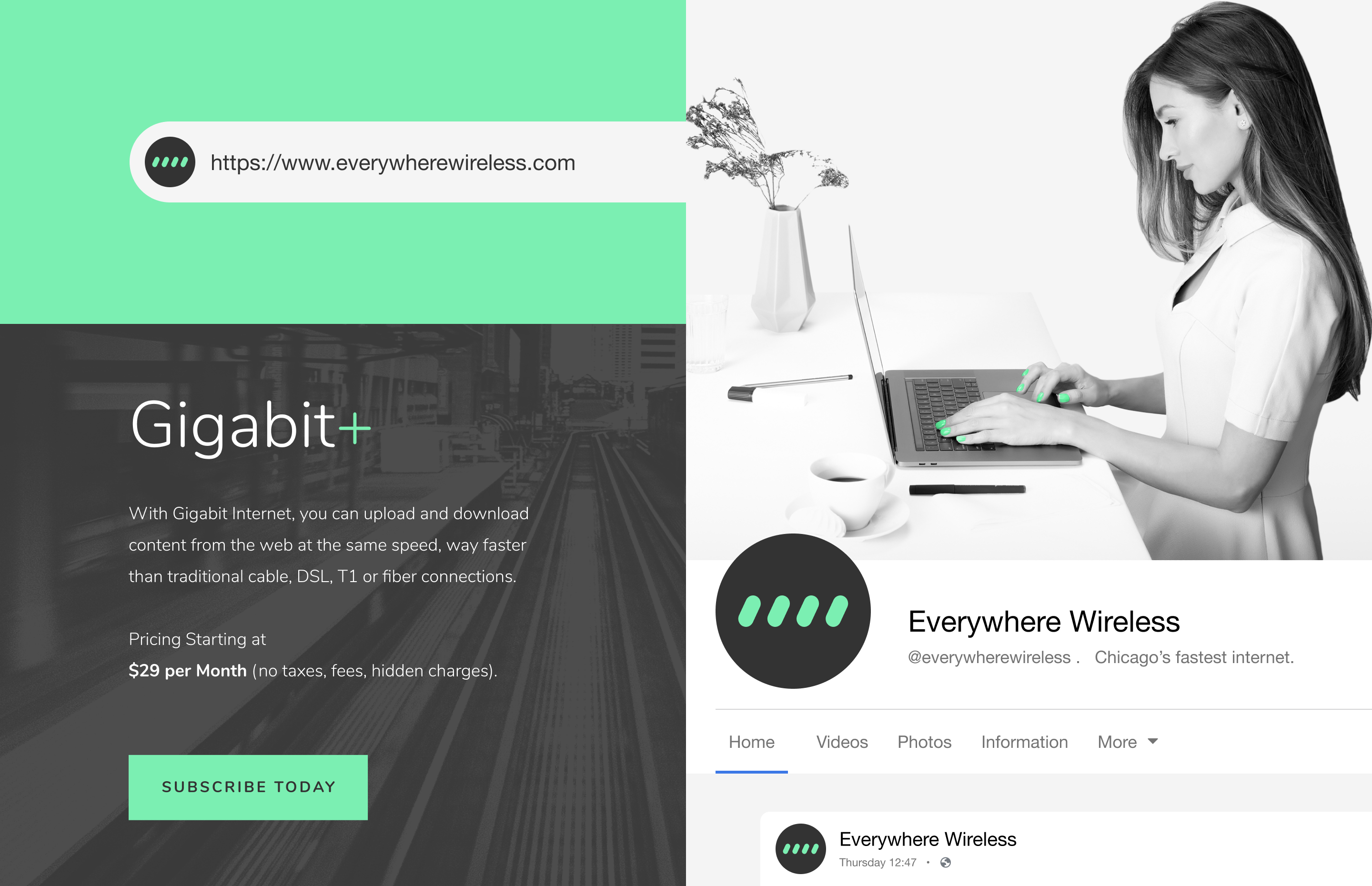
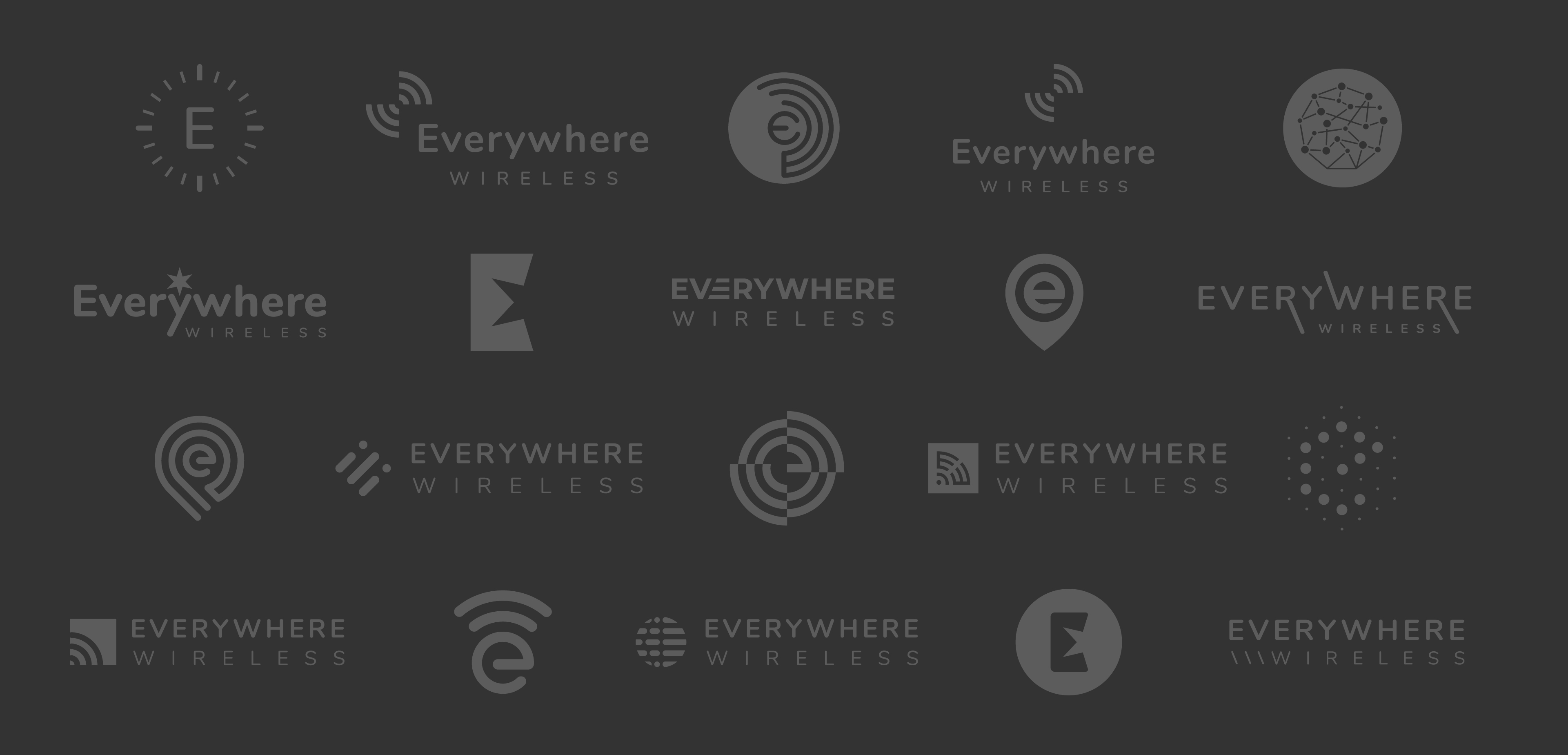
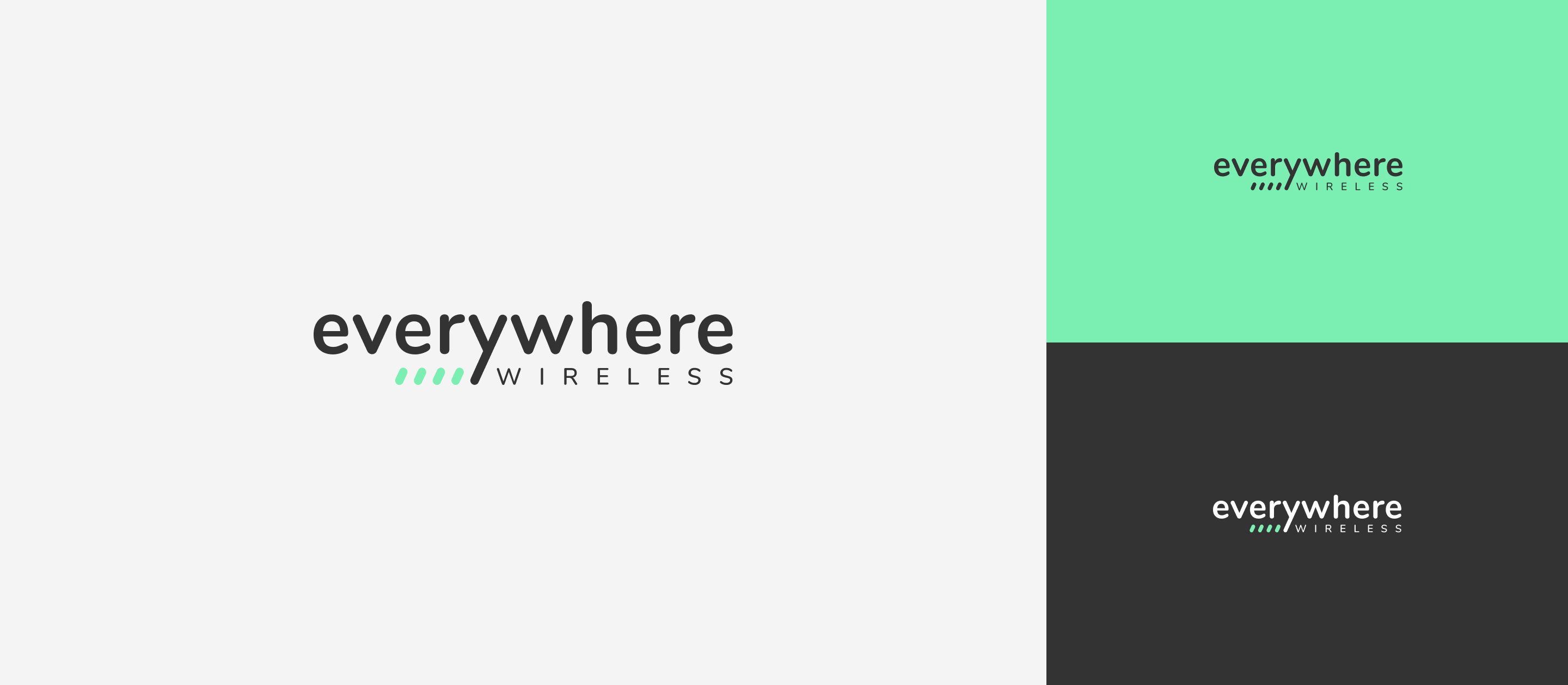
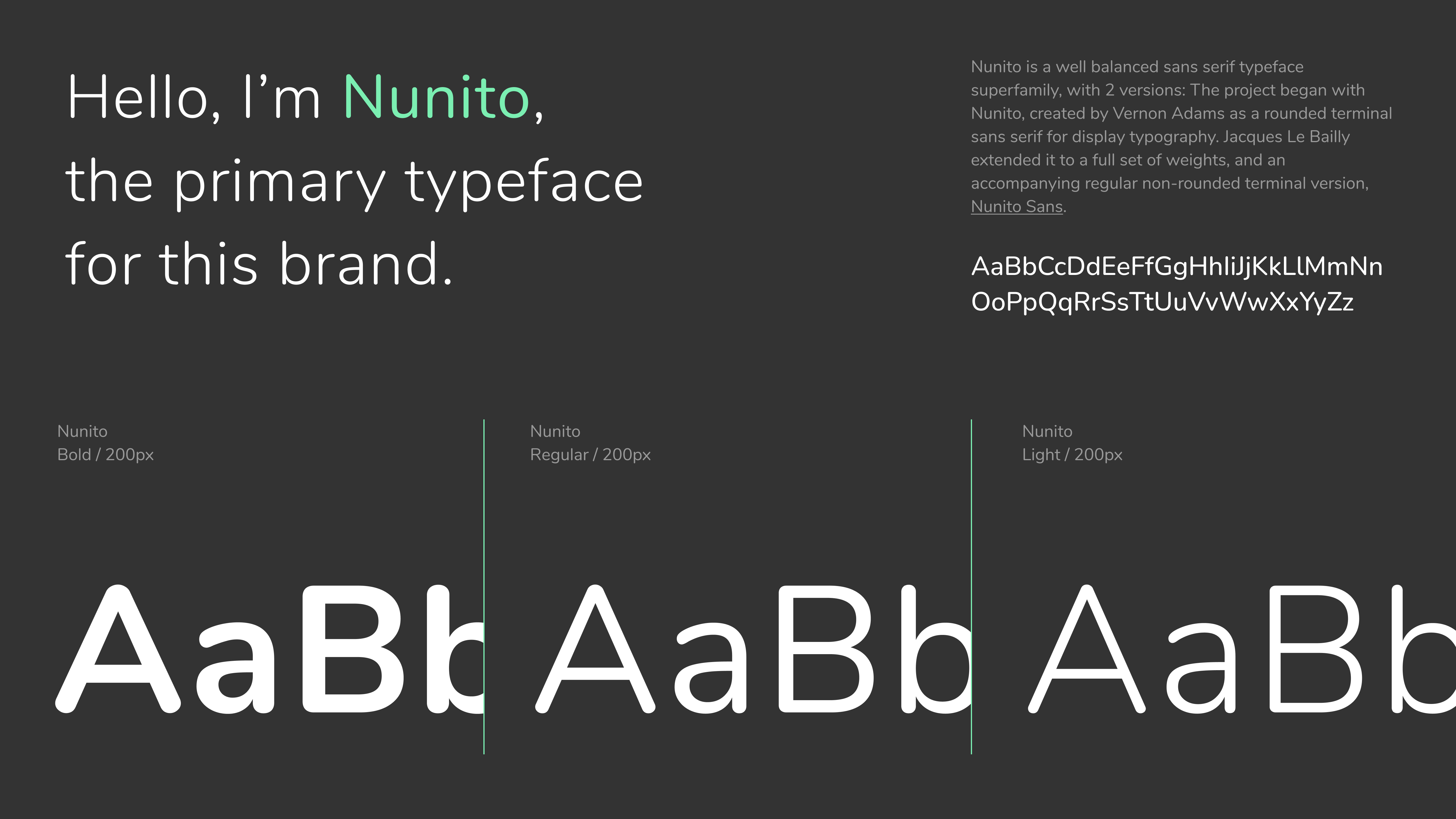
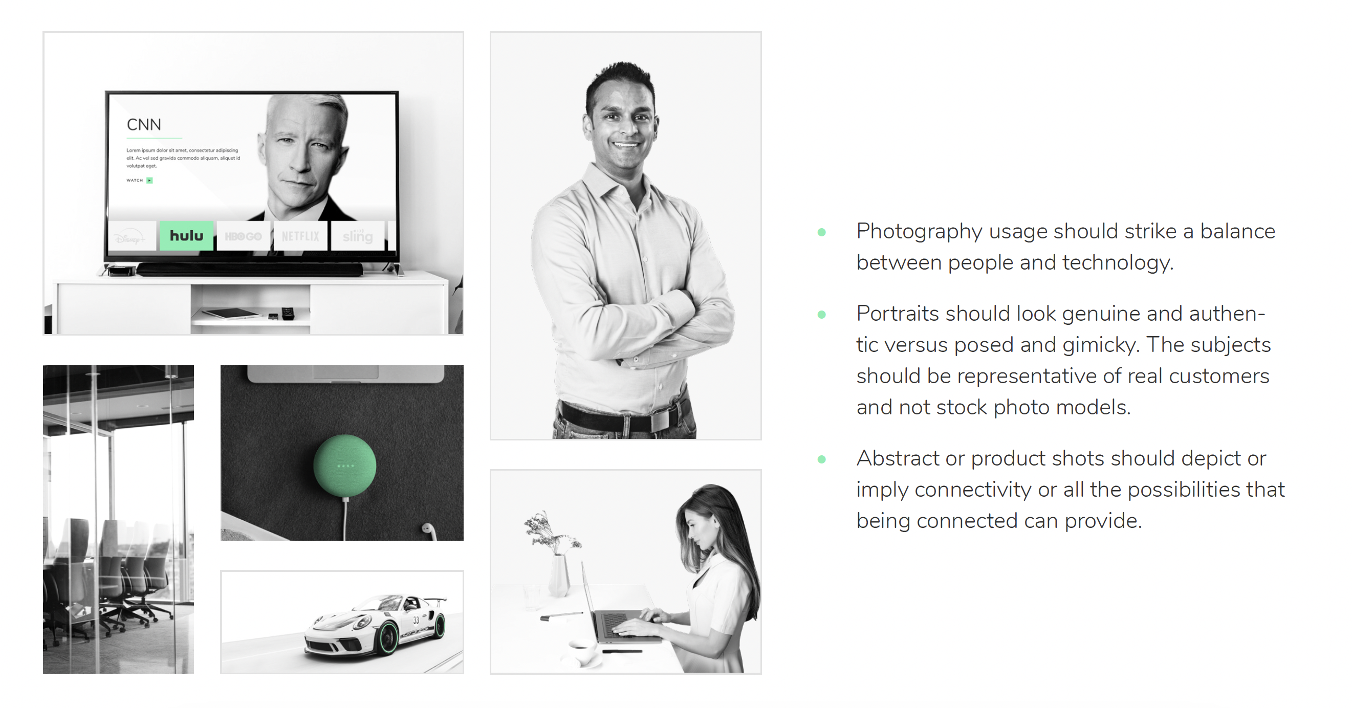
We explored multiple directions for the mark, from wordmarks and monograms to icon-based concepts, refining the strongest direction until it could stand confidently on its own. From there, we built out the broader identity through color, typography, and tone, creating a cohesive system.
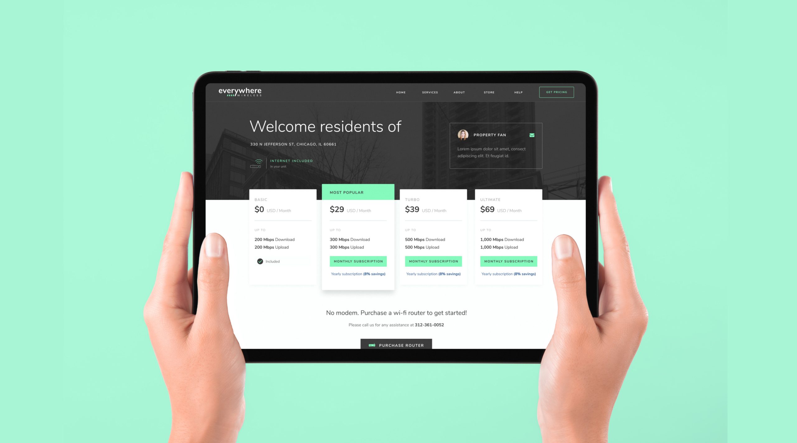
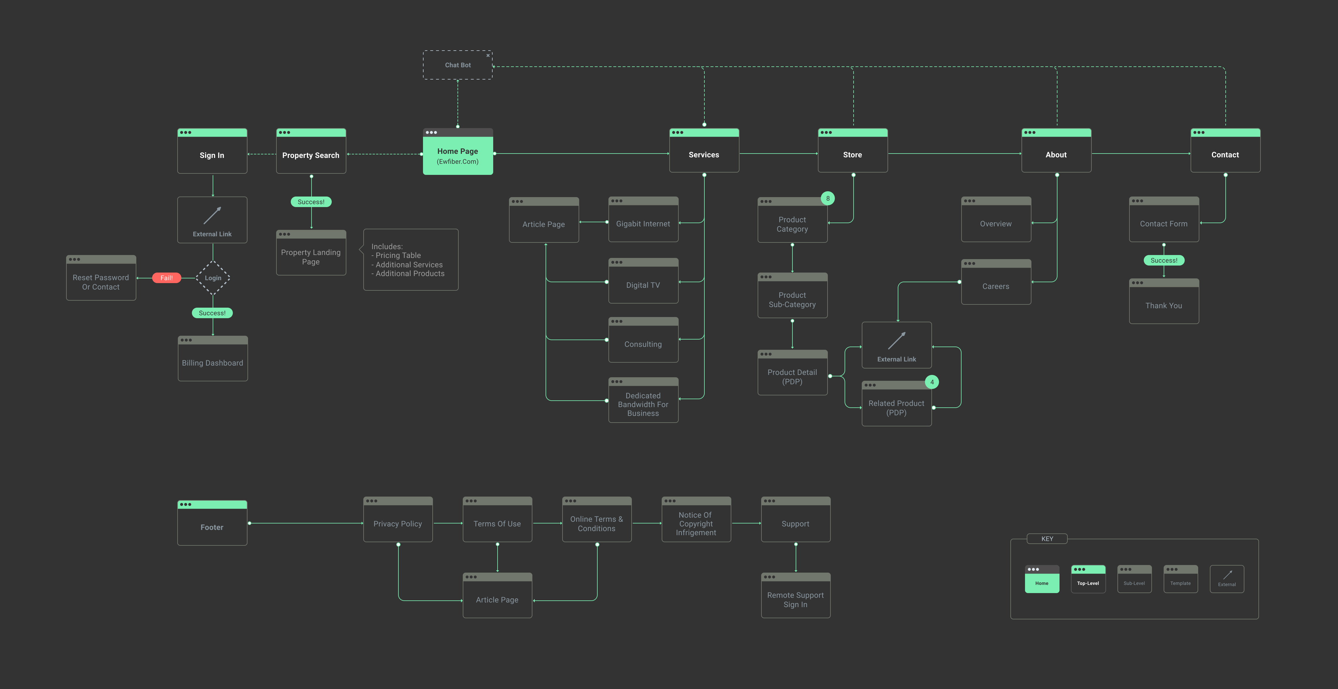
The existing site had no clear hierarchy and buried products behind navigation that didn't reflect how customers actually shopped. We started with a sitemap to define the information architecture, moved into wireframes, then applied the brand system to every surface before handing off.
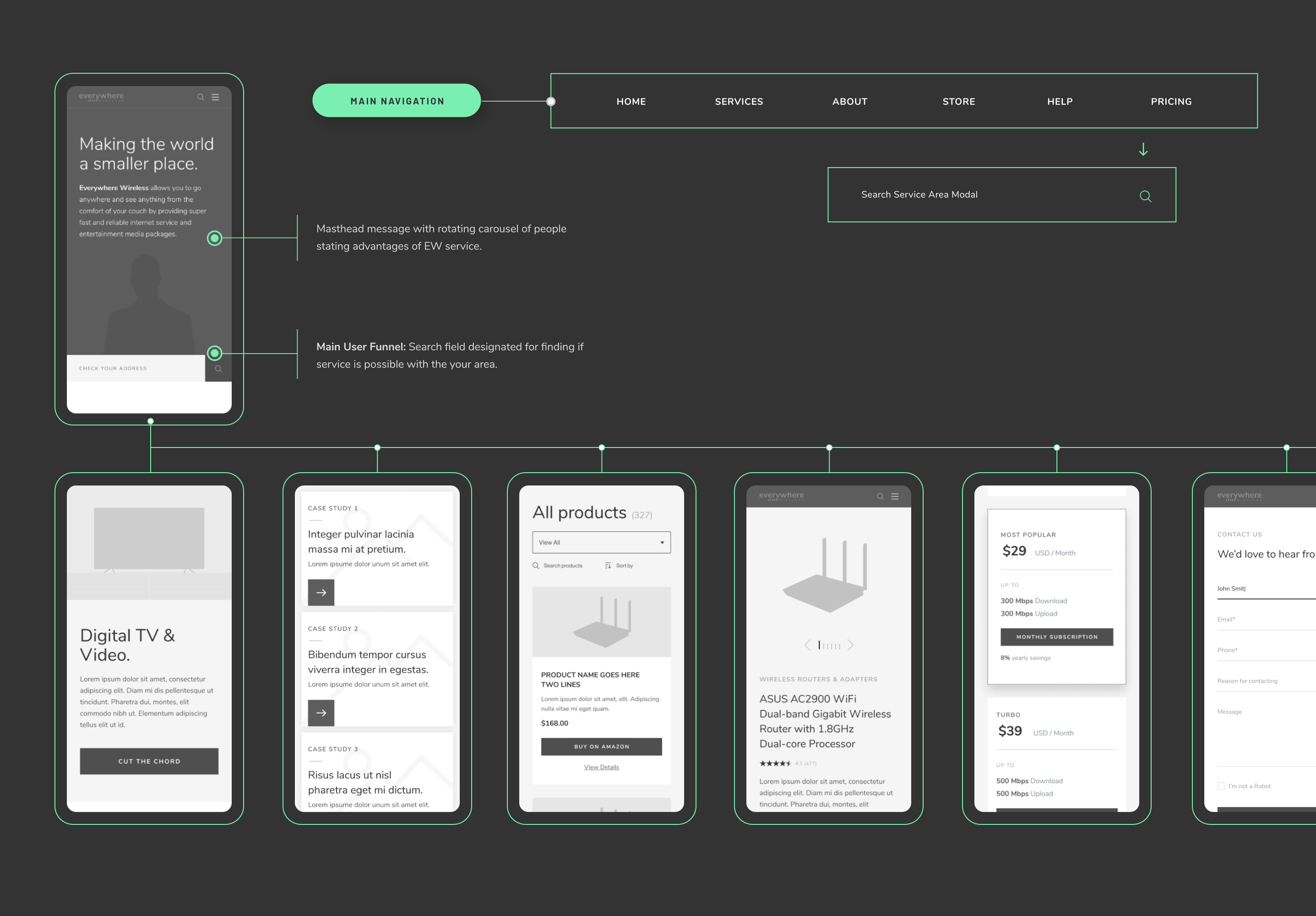
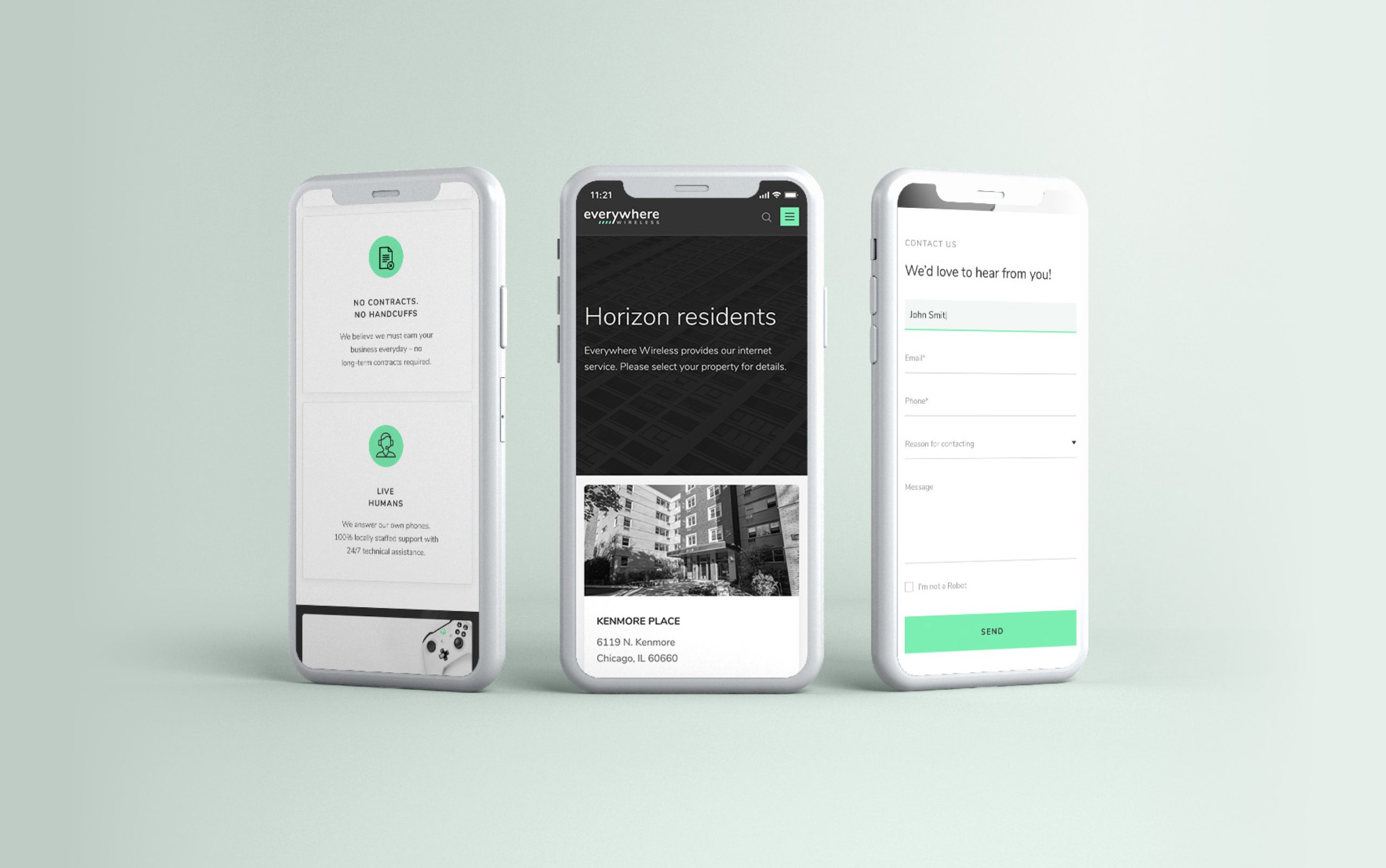
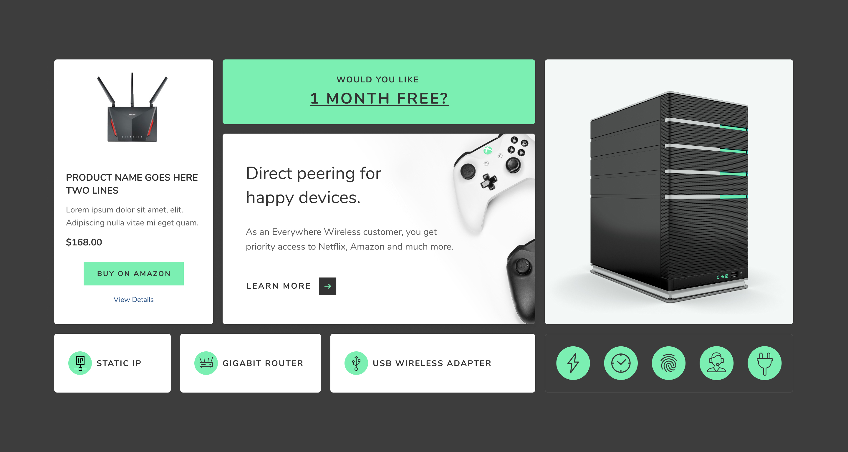
A component library covering product cards, navigation, forms, search, and interactive states gave the development team a stable foundation to build from and scale naturally as the product catalog grows.
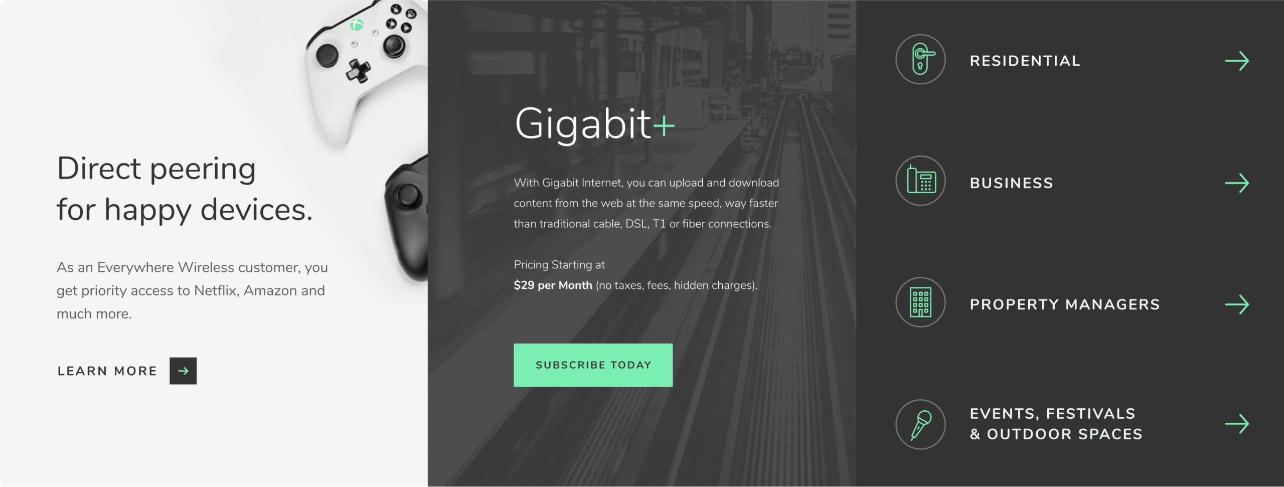
The final site carries the new brand all the way through, from landing page to checkout. Mobile received the same design rigor as desktop. The result is an experience that earns the trust of a customer before they've read a single product description.