Credentialing eats up a huge amount of time in healthcare. Nurses and facilities have to verify credentials, keep track of renewals, and stay compliant, and the work never really lets up.
Kloc wanted to modernize all of that with a platform that handles the heavy lifting automatically and shows everyone involved exactly where things stand.
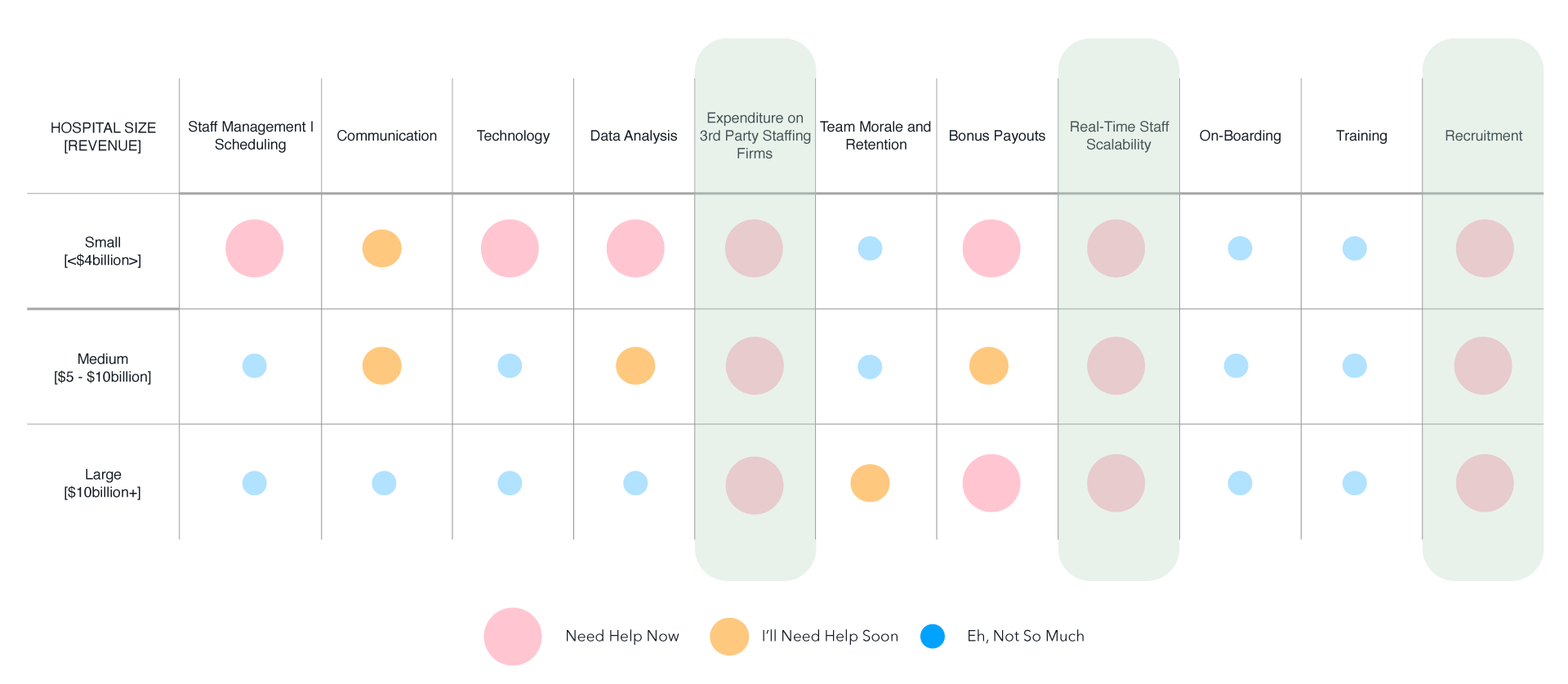
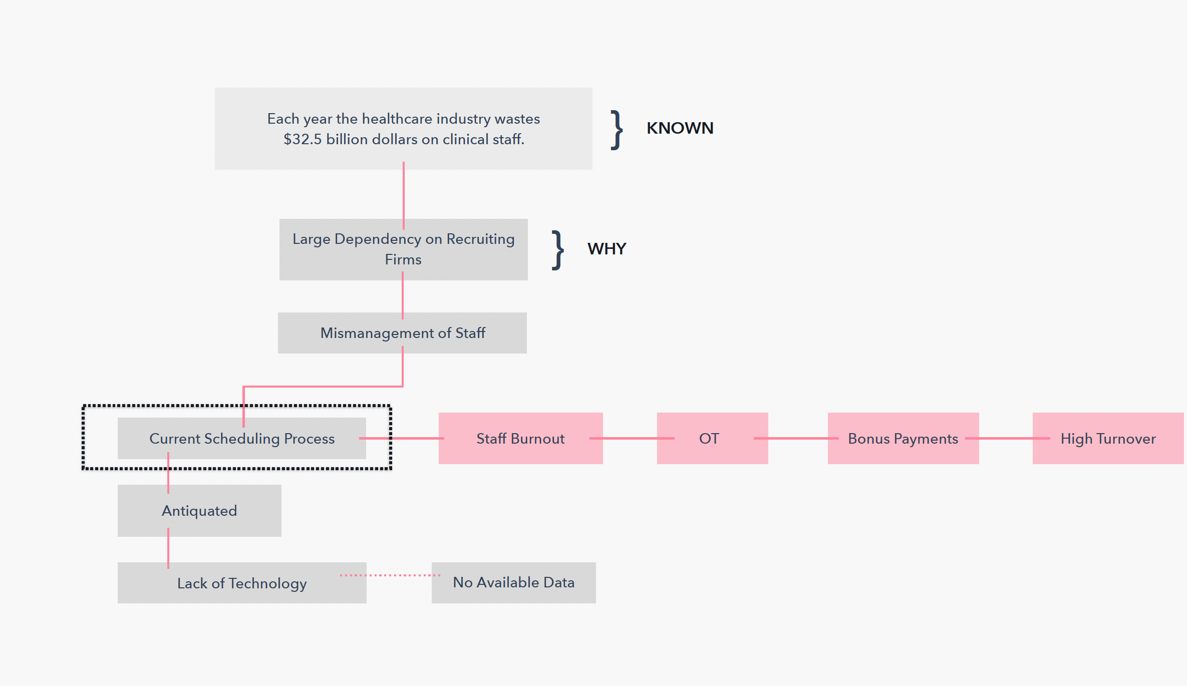
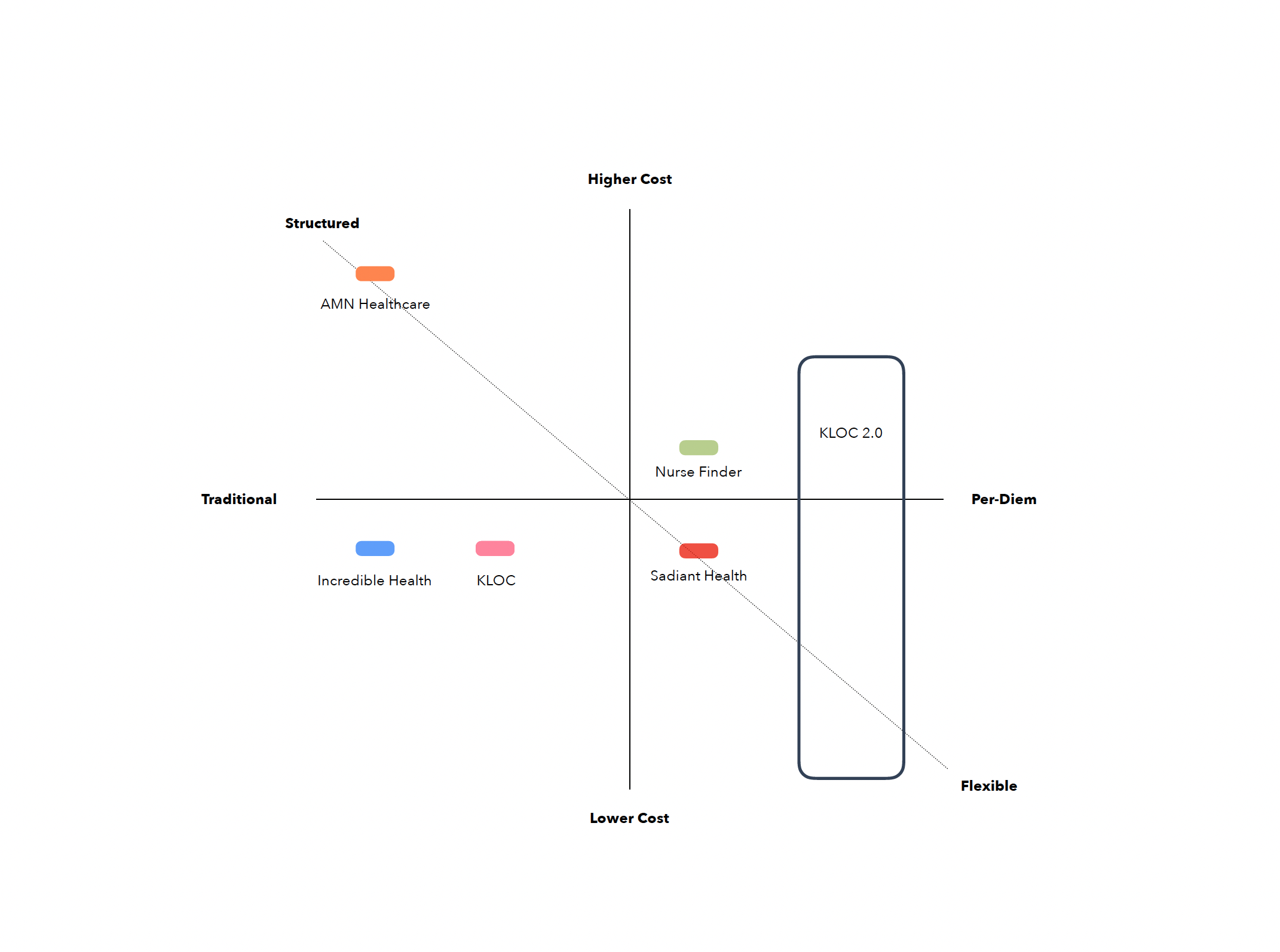
We talked to users and looked closely at competitors, and the same problems kept coming up. Documents were scattered across different systems, nobody could see when renewals were due, and all the manual back-and-forth dragged things out by weeks. We turned those findings into hypotheses, and they shaped every design decision that followed.
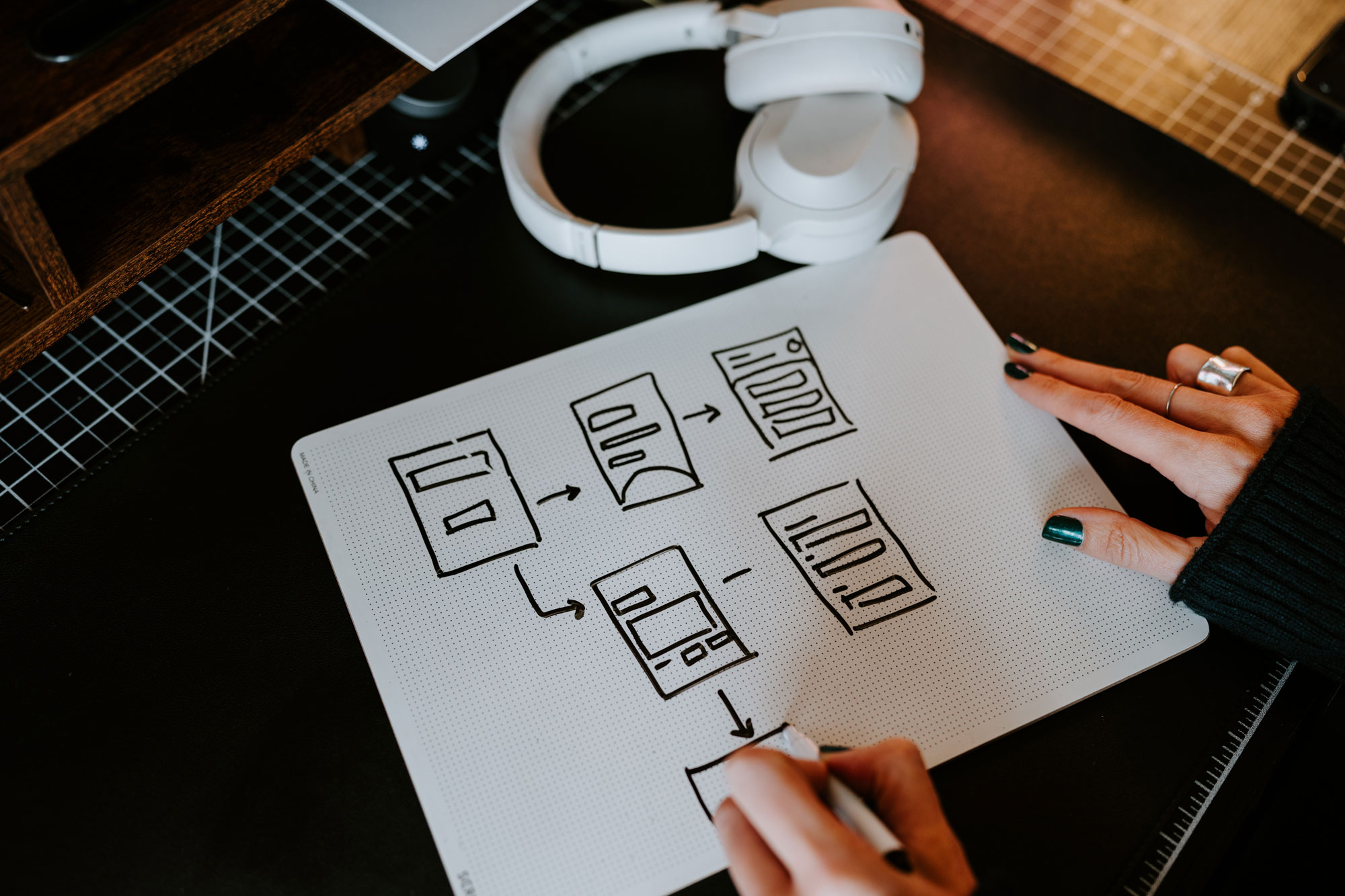
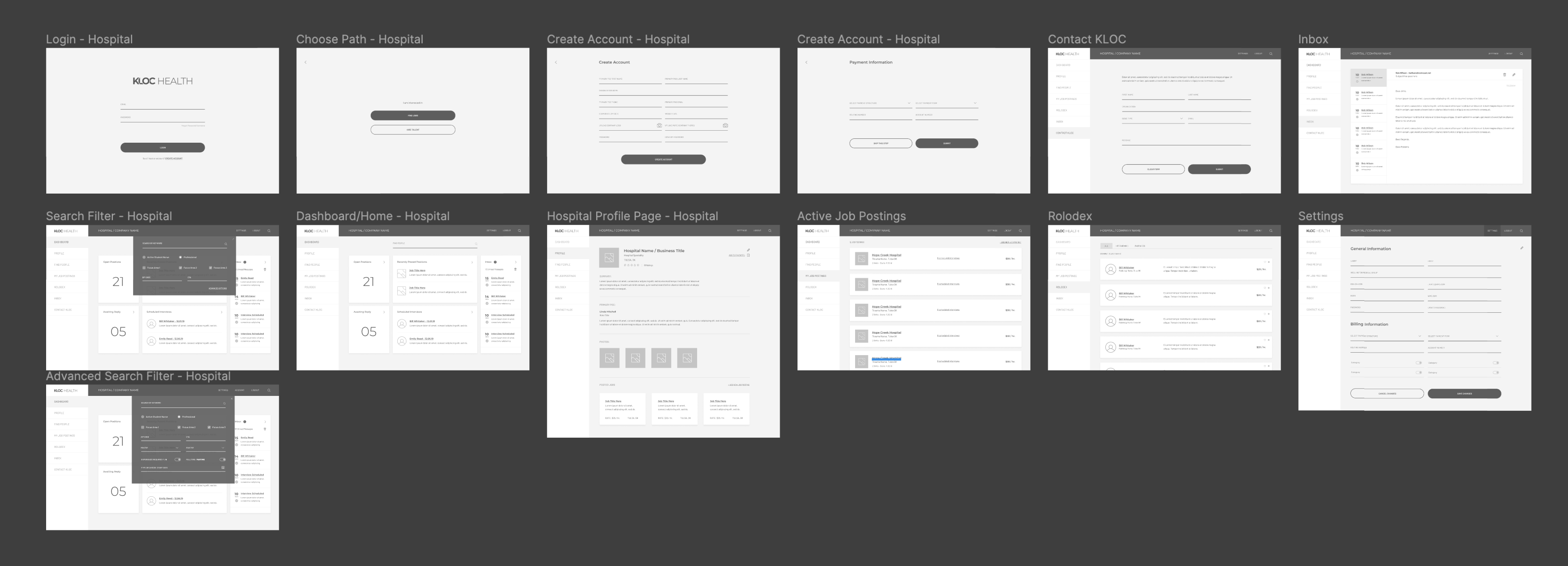
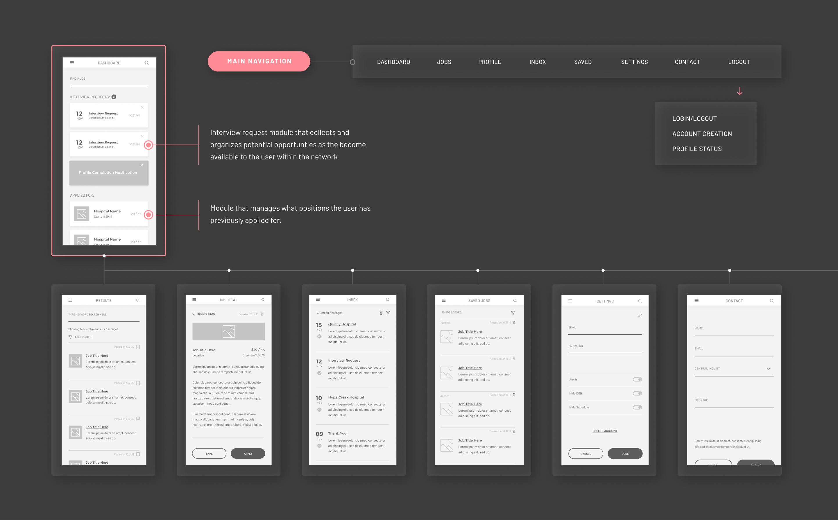
We started on paper because it let us move fast, try different structures, and test the flows before putting anything in Figma. From there we built detailed desktop wireframes and walked the team through the intake, verification, and notification flows before any visual design began.

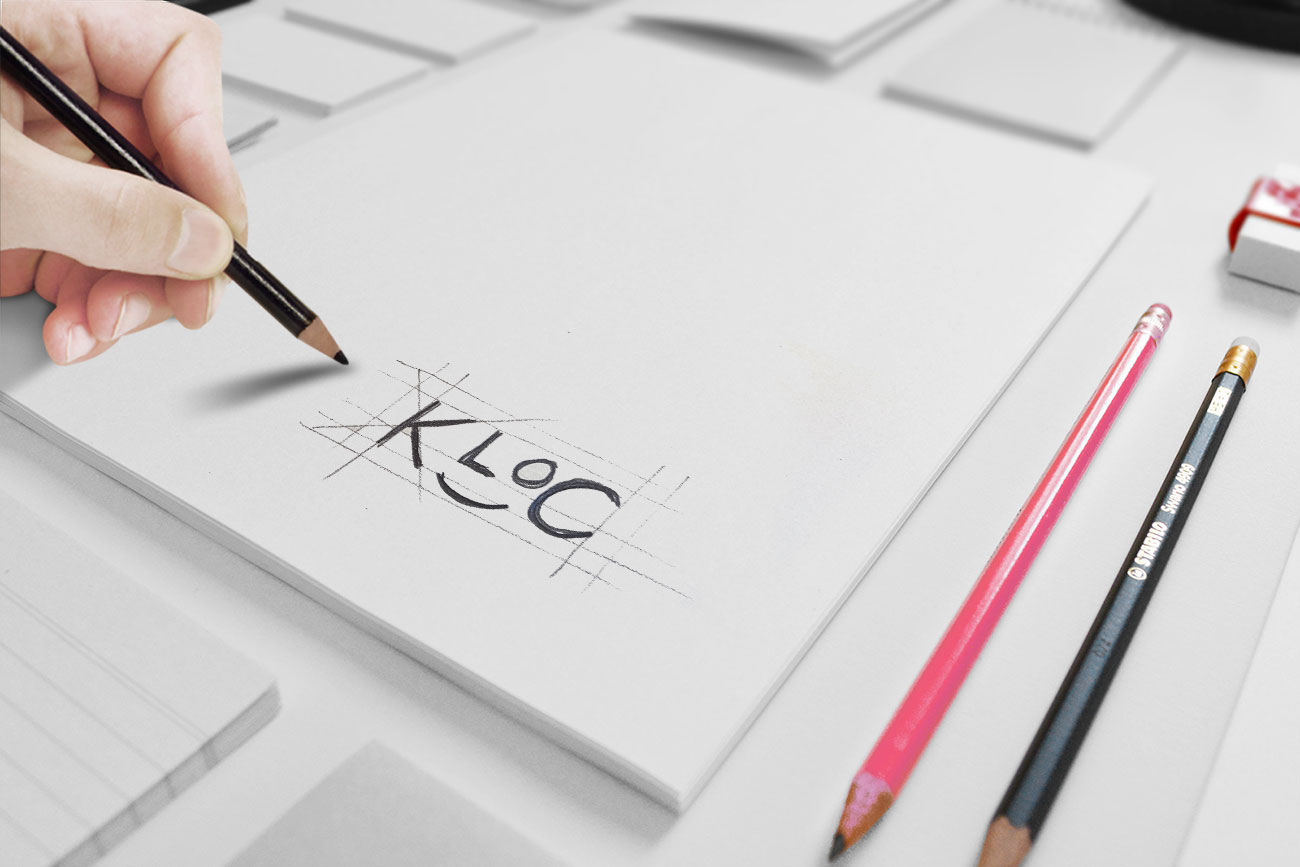
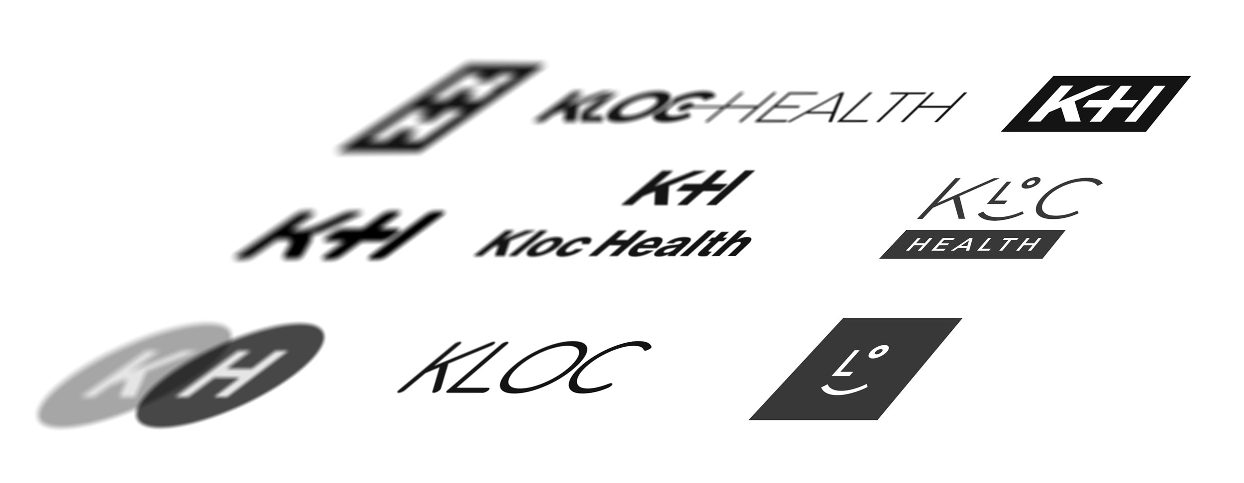
The logo started as sketches of marks that suggested structure, verification, and trust. The direction we chose stood apart from the usual healthcare look. It felt grounded and clean, and it worked just as well on screen as it did in print.

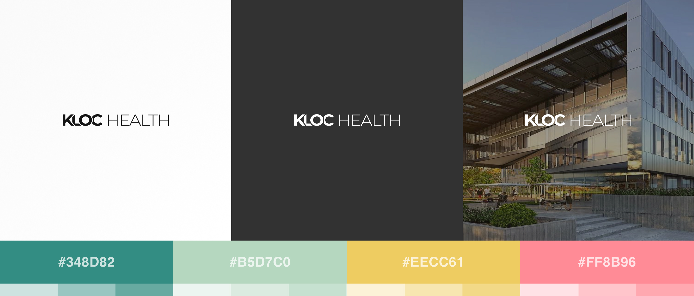
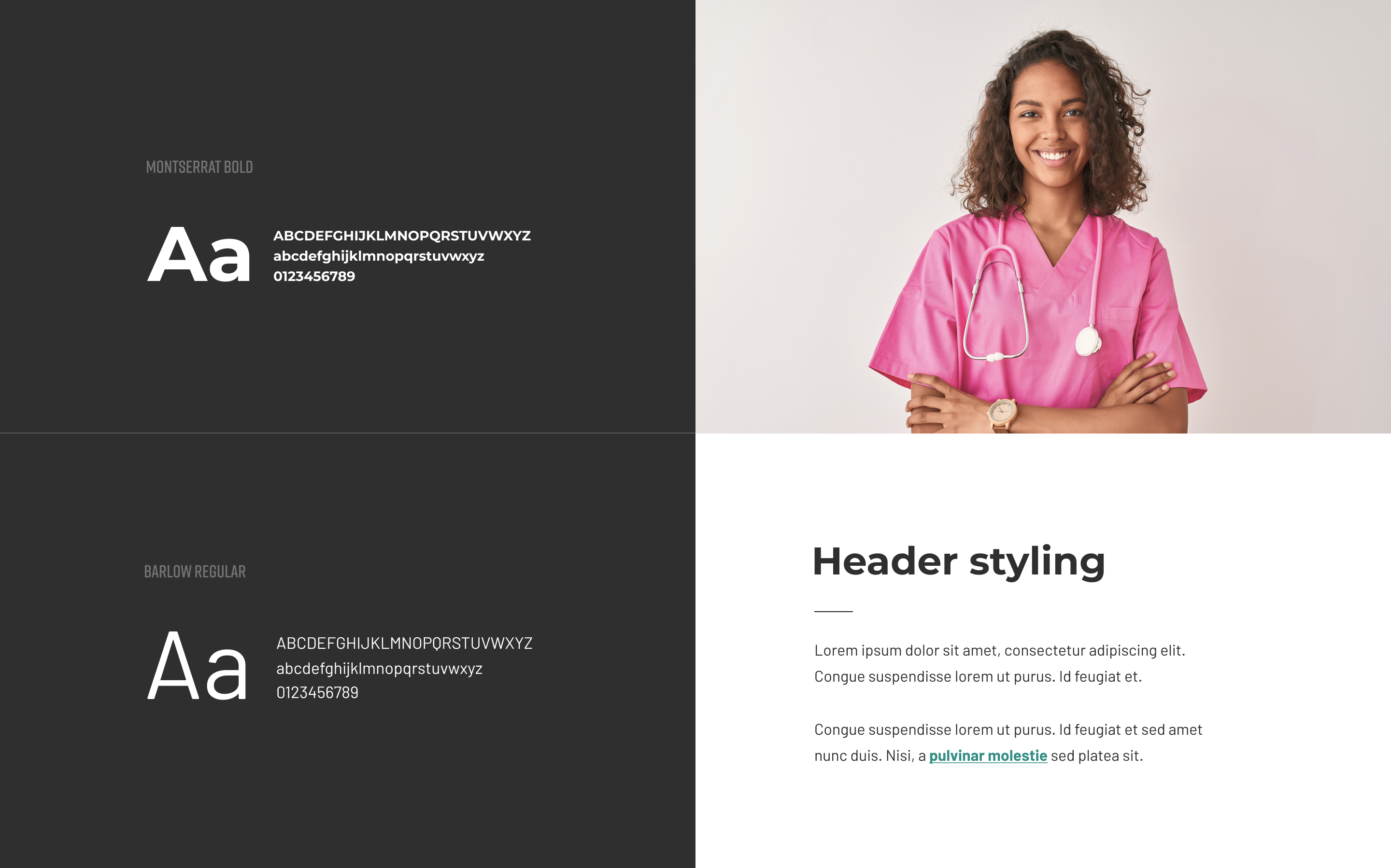
The palette pairs a clean, neutral base with a warm accent, steering clear of the cold blues you see in most healthcare software. We chose the typography for how well it reads in dense layouts, since clinicians use this data-heavy product under pressure. The icons follow the same logic as the logo: simple shapes, a consistent stroke weight, and still readable at 16px.

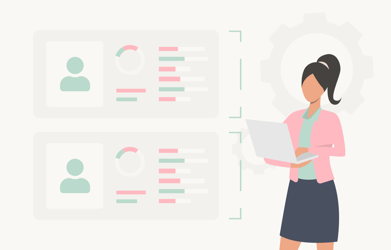
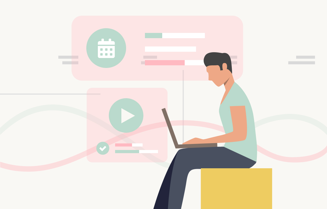
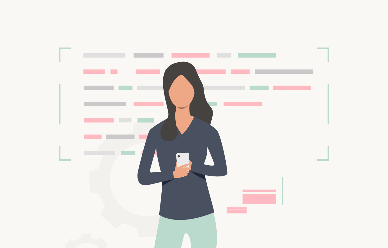
We created custom illustrations for the platform's five main features: credentials management, automated workflows, access control, transparency, and notifications. They gave marketing and onboarding a consistent visual style that feels unique to Kloc.
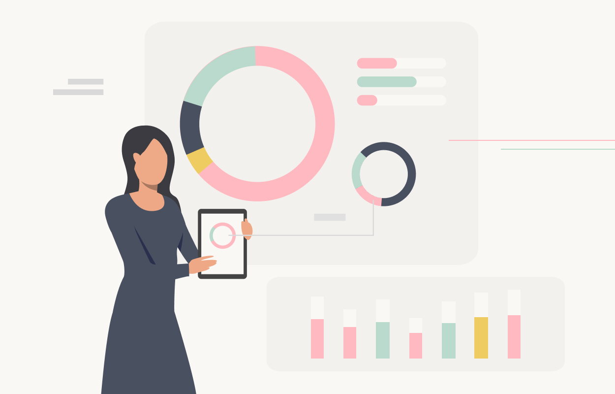
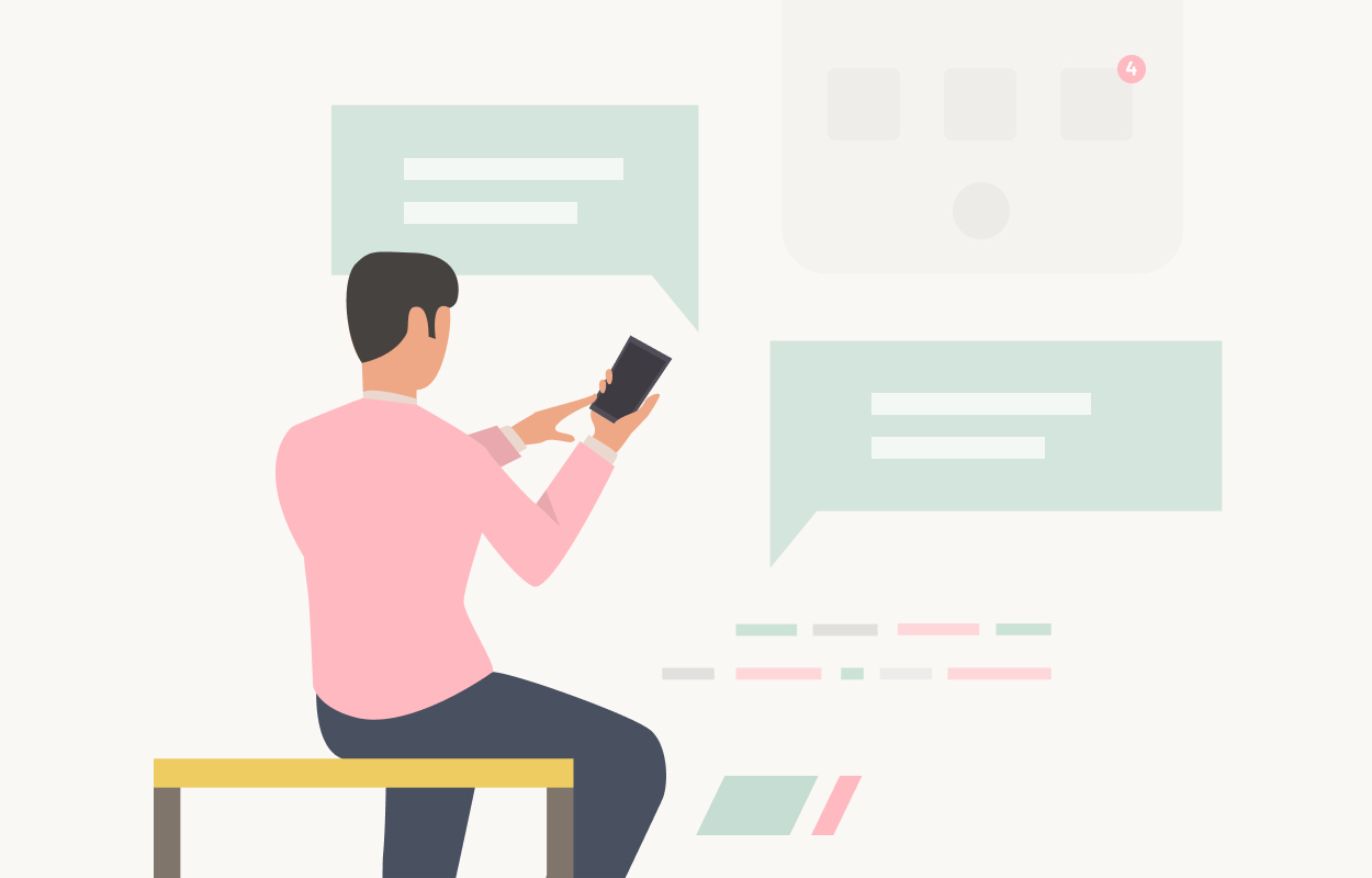
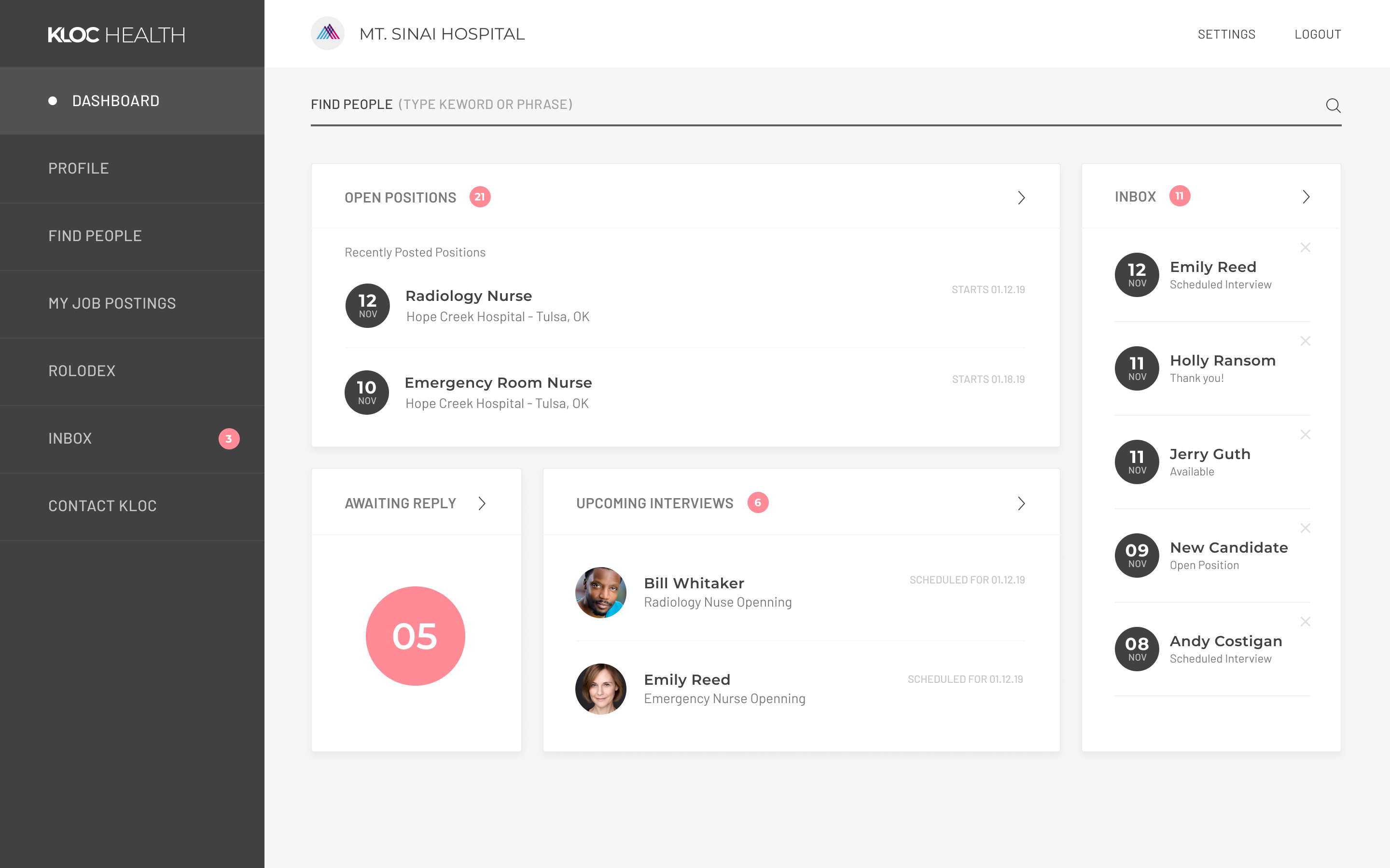
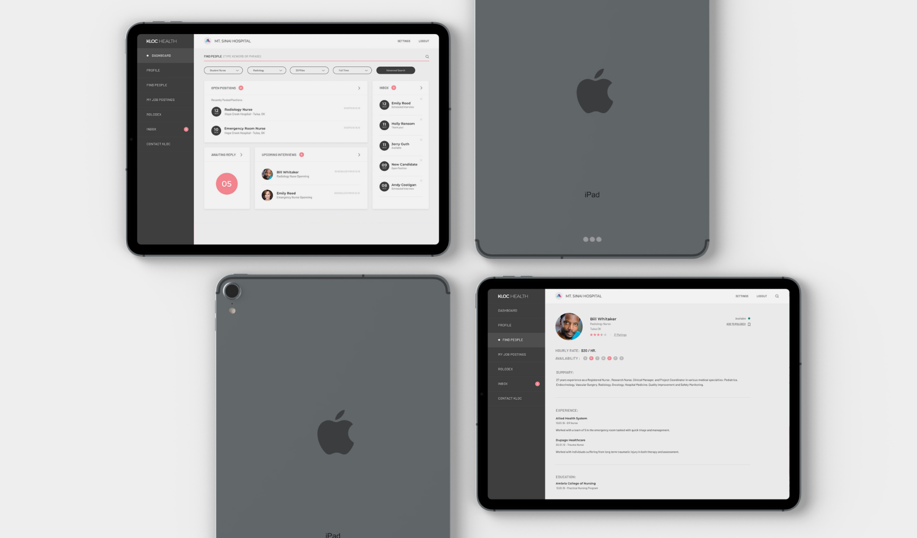
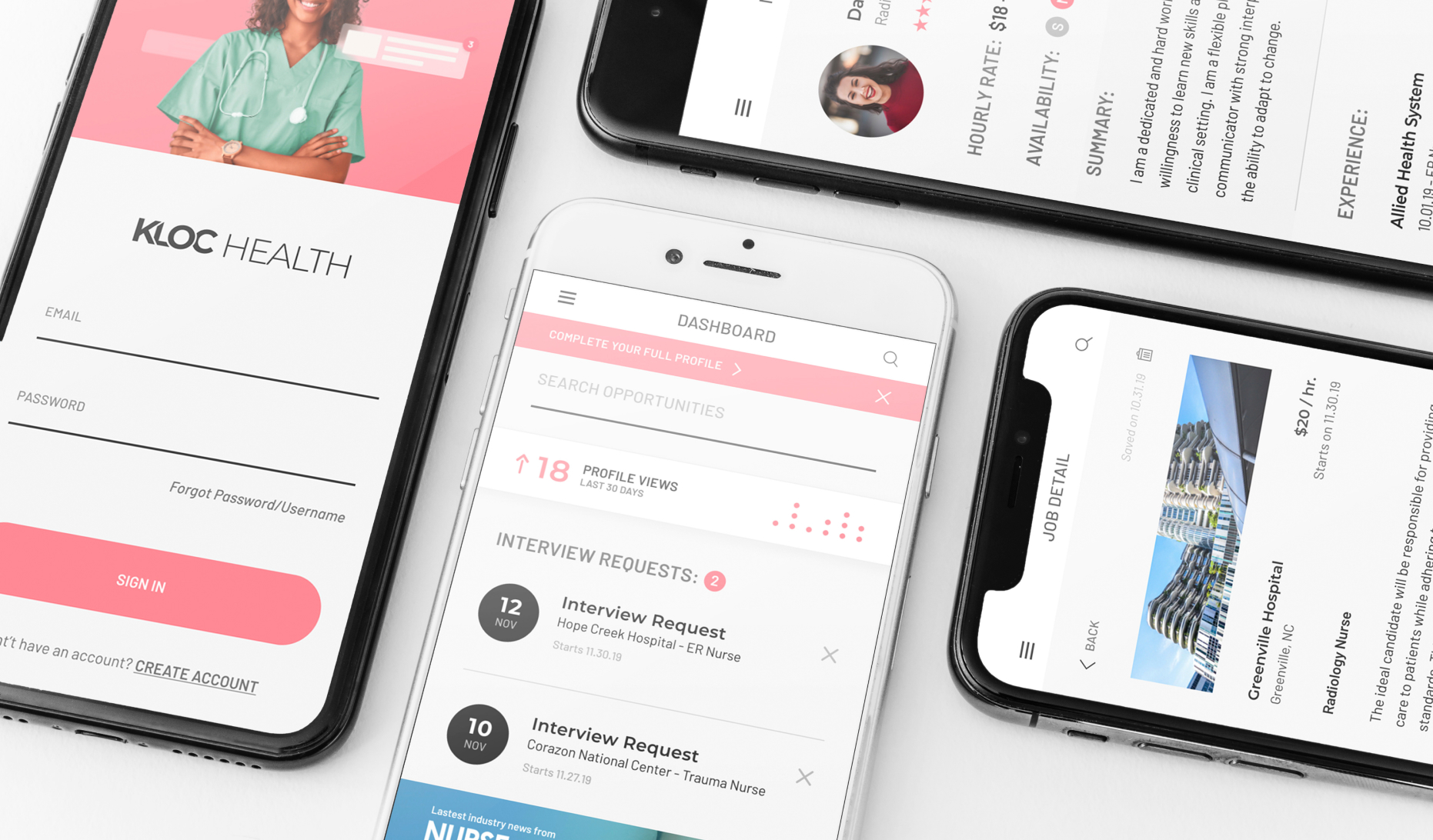
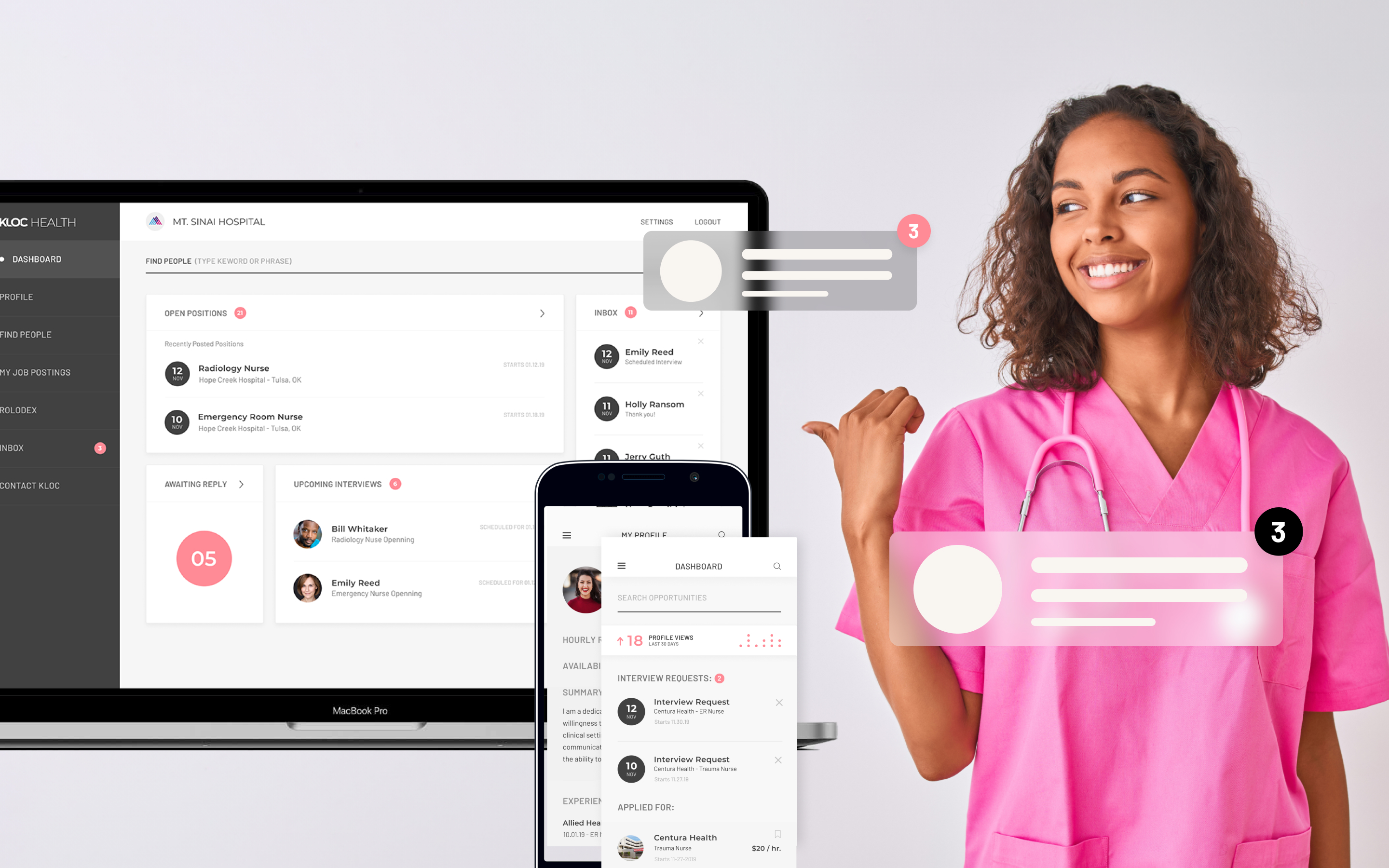
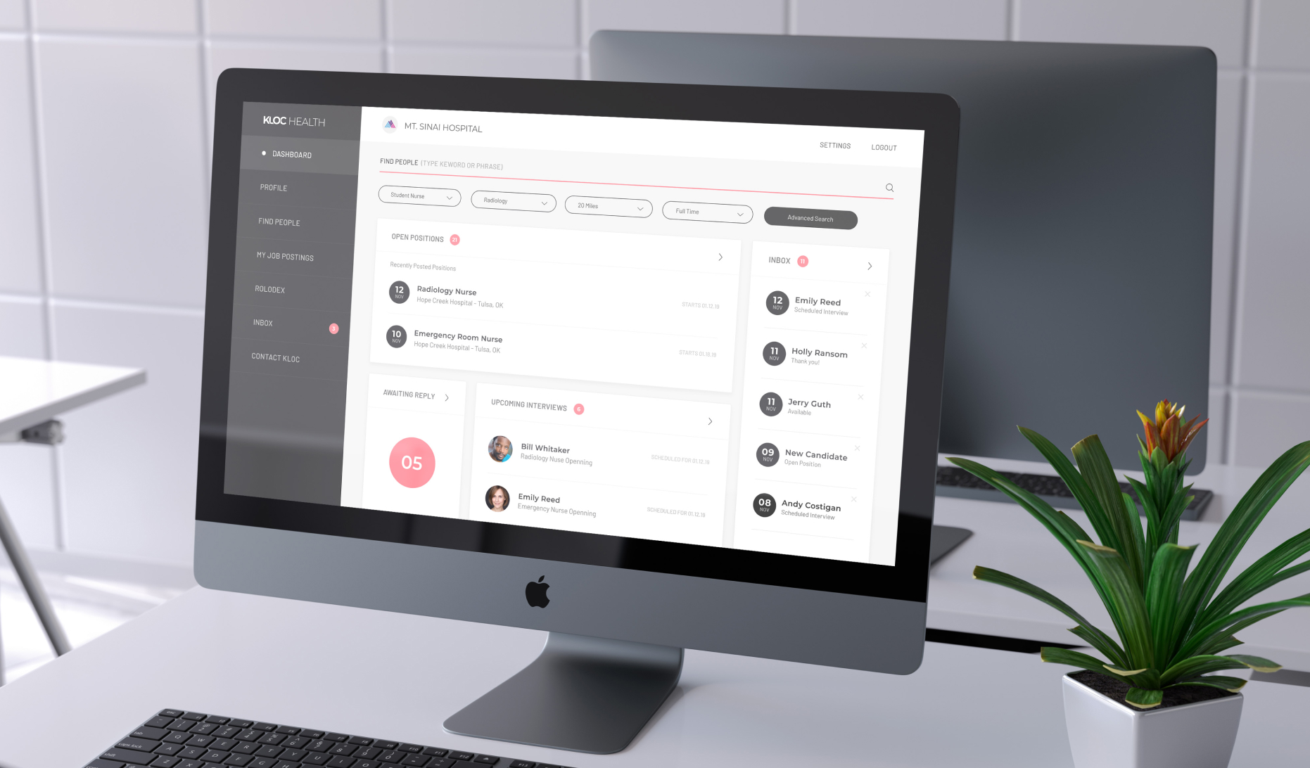
The final product puts everything a clinician or facility admin needs right up front, like credential status, upcoming renewals, and where each verification stands, without making them dig through menus. We designed the dashboard around how people actually work rather than a list of features, so urgent items stand out and everything else is still easy to find.