
Genesis Products manufactures laminate panels, cabinet doors, drawers and interior components for OEMs across RV, cabinetry, work vehicle and commercial interiors. Since its site launched in 2021, the business had grown into a market leader in four industries, but the site still read like a catch-all product catalog.
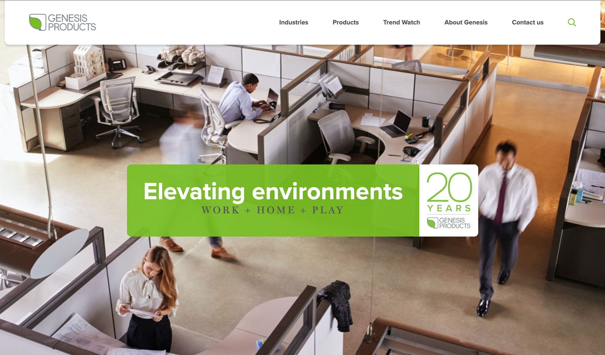
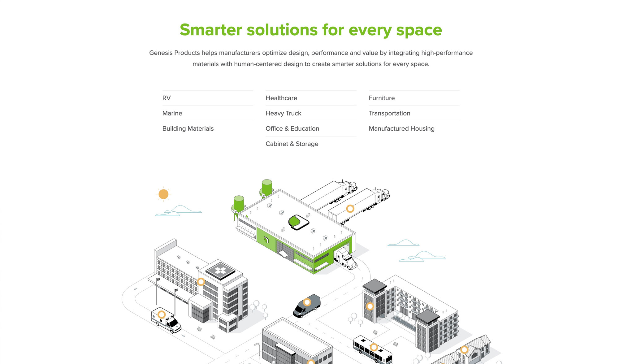
We baselined the existing site with first-impression timeout tests, task-based usability sessions and a System Usability Scale survey. That gave us a benchmark the redesign would have to beat, and a specific list of problems to design against.
Homepage SUS score: users liked the look but couldn't explain the business
Navigation SUS score when users were asked to find specific products
Target score the new design had to clear
Buyers never browse across industries. An RV manufacturer doesn't care about acoustic ceiling tiles. So we rebuilt the sitemap and navigation around the four industries where Genesis leads and gave every product a single, predictable path: industry, then category, then product line.
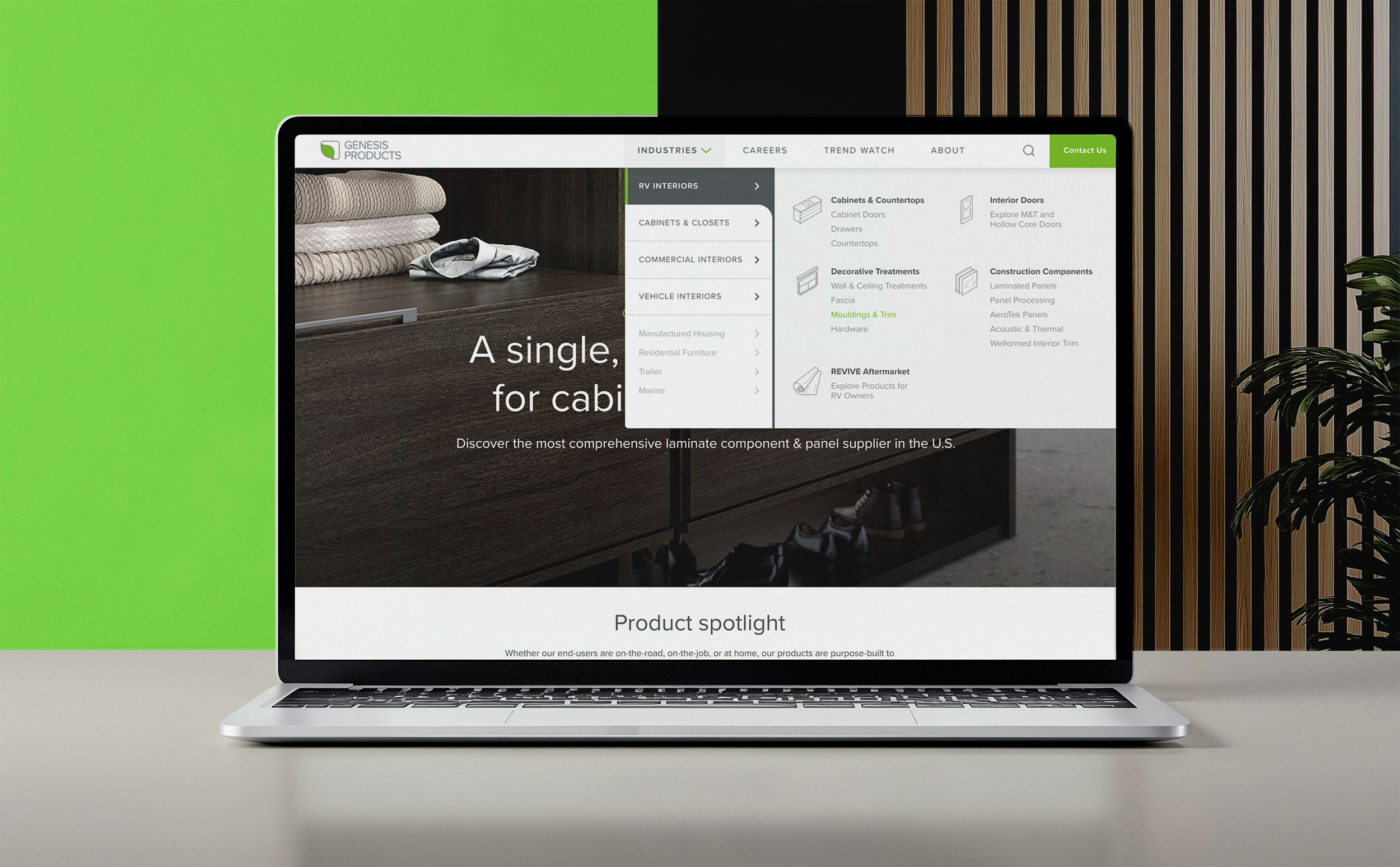
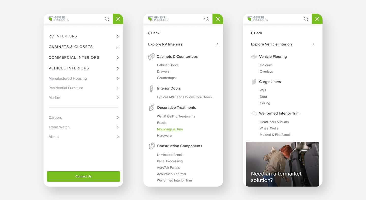
The old hero video showed so many settings that users couldn't tell what Genesis made. We replaced it with a split visual navigation. One industry gets the spotlight, the other three sit beside it, and each panel opens with a single "Explore" action.
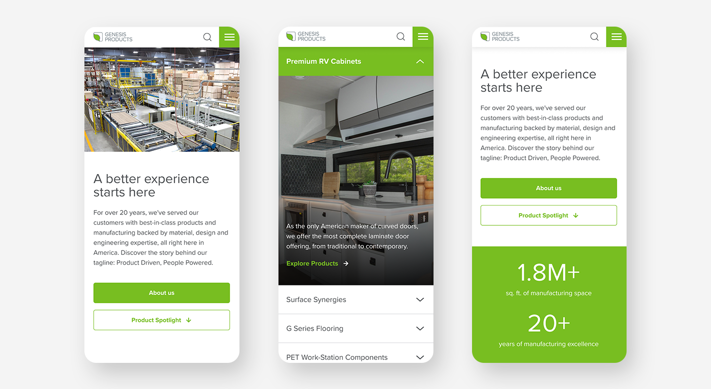
Every page below the homepage is assembled from the same modules: a hero, a "jump to" bar into the categories, an intro story, then whichever content blocks the page needs. That kept industry, category and product pages consistent enough to scale, while each industry still gets its own photography, partners and proof.
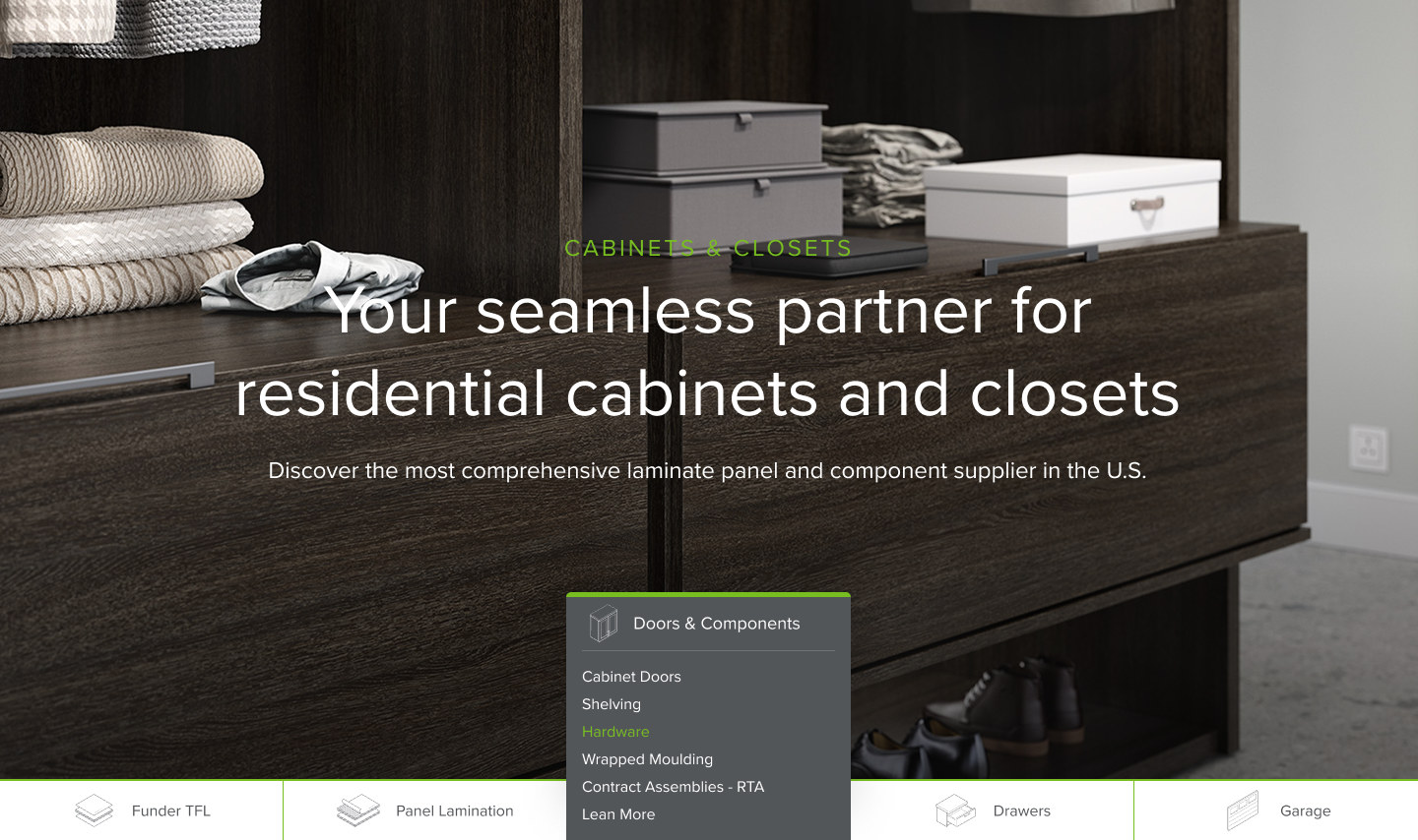
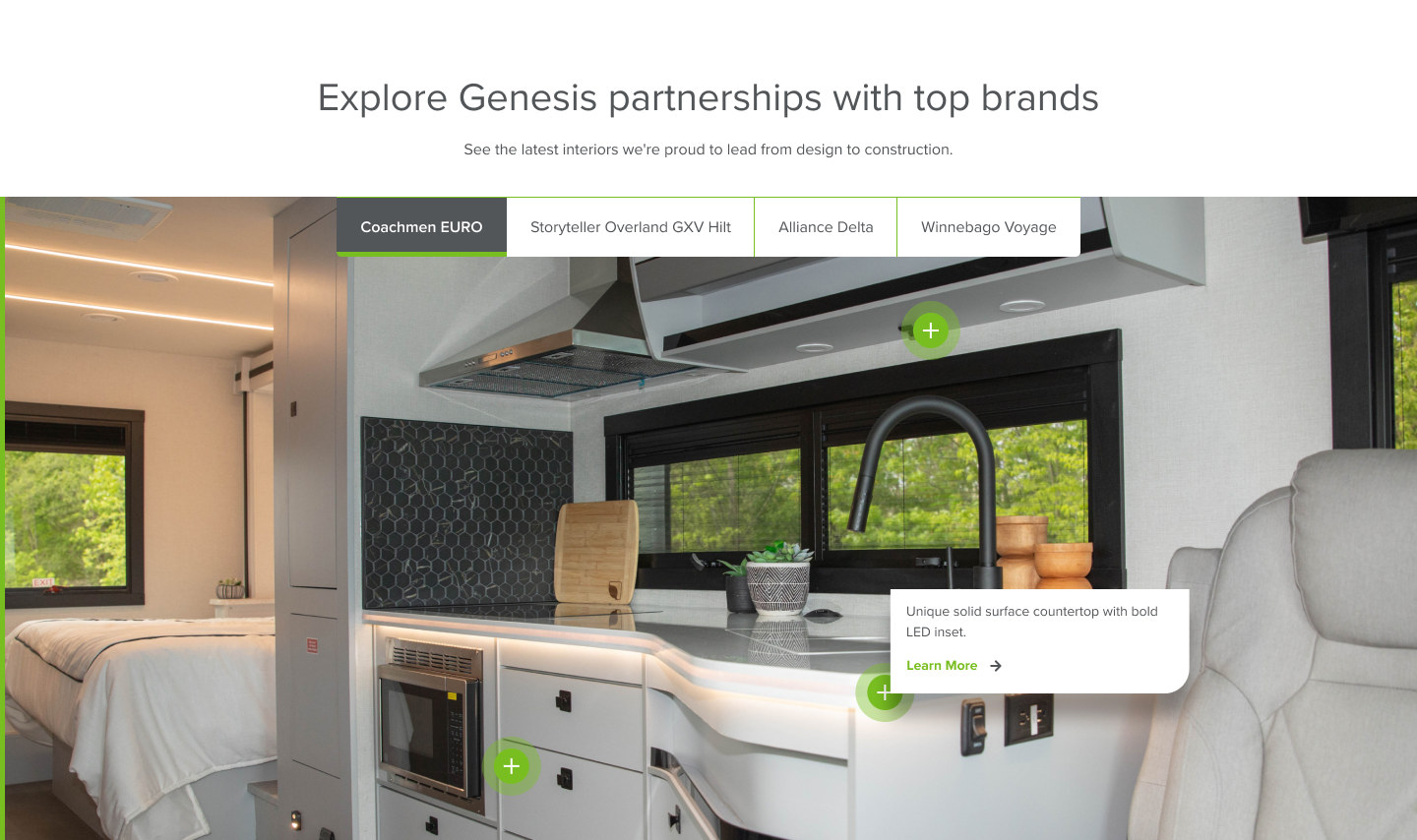
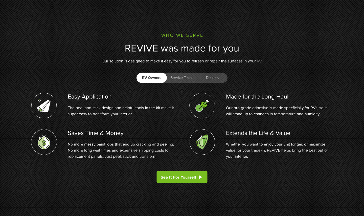
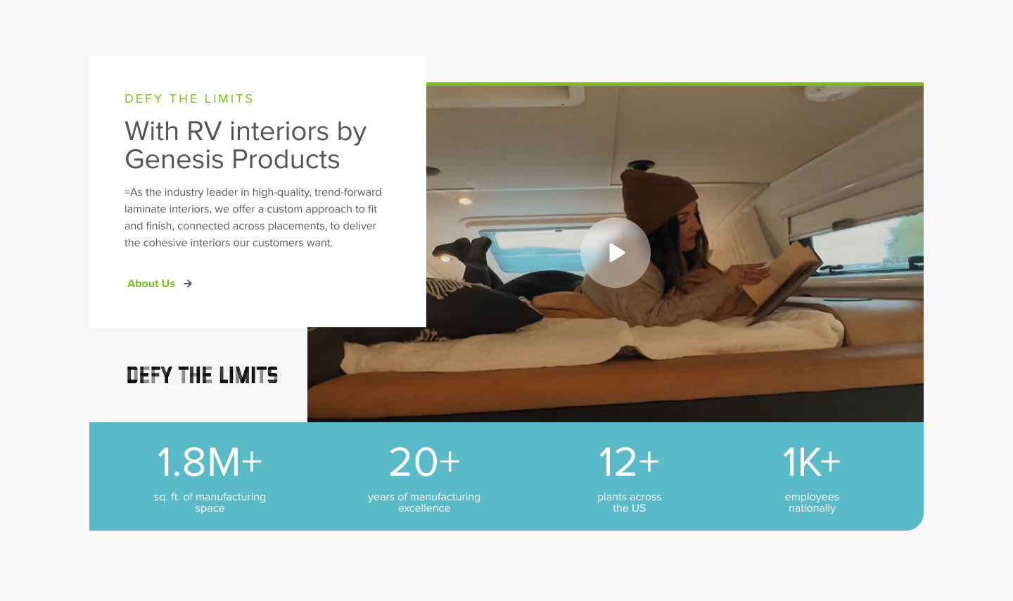
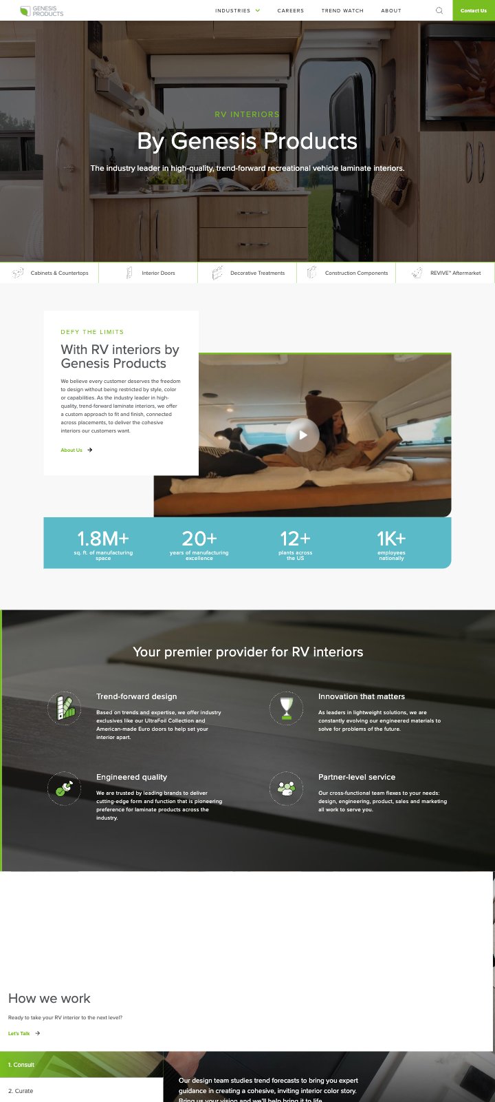
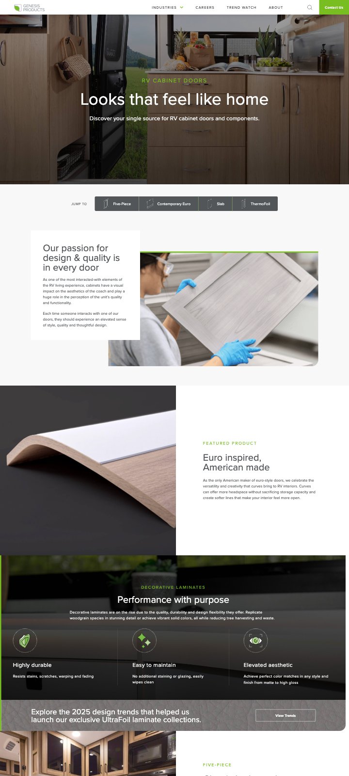
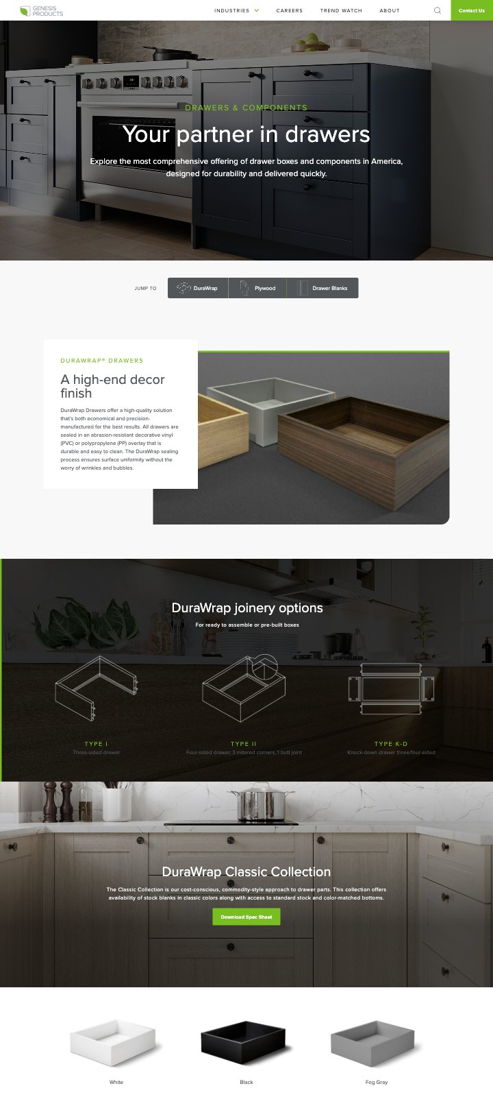
Genesis needed to add product lines and refresh content without waiting on a designer. We built the system in Figma from the brand guidelines up. That meant Proxima Nova and Miller Text type scales for desktop and mobile, green, blue, orange and gray color tokens, and two industry icon families: illustrated icons for large tiles and line icons for tabs and filters.
After launch, visitors went deeper into the site, stayed longer and contacted sales more often. That's the outcome the brief asked for: visitors who leave thinking, "Genesis is legit. I want to do business with these folks."
Pages per visit
Time on site
Conversion rate on contact