Improving navigation, product discovery, and the path to purchase for one of the most trusted names in off-road lighting.

View Site

My role

  • UX audit & competitive research
  • Information architecture
  • UI design & design system
  • Mobile experience

Teammates

  • Megan Woo (Sr. Frontend Engineer)
  • James Park (eComm PM)
  • George Blitzer (eComm Director)

Results

  • Improved product findability
  • Streamlined navigation structure
  • Created a full design system and brand guidelines
  • Improved consistency across 60+ pages
Overview

Transitioning from a utility brand to an adventure brand.

KC HiLiTES has been the definitive name in off-road lighting since 1970. But their website wasn't keeping pace with their reputation. The leadership team wanted an end-to-end design partner that could bring the brand and website up to the standard of the product.

KC HiLiTES product 4Runner
Research & Planning

Before designing anything new, we mapped every friction point across the existing site.

Website audit and heatmap data from Hotjar surfaced exactly where users dropped off and what they couldn't find. Users struggled with navigation depth, couldn't filter by vehicle compatibility, and frequently bounced off product pages before converting.
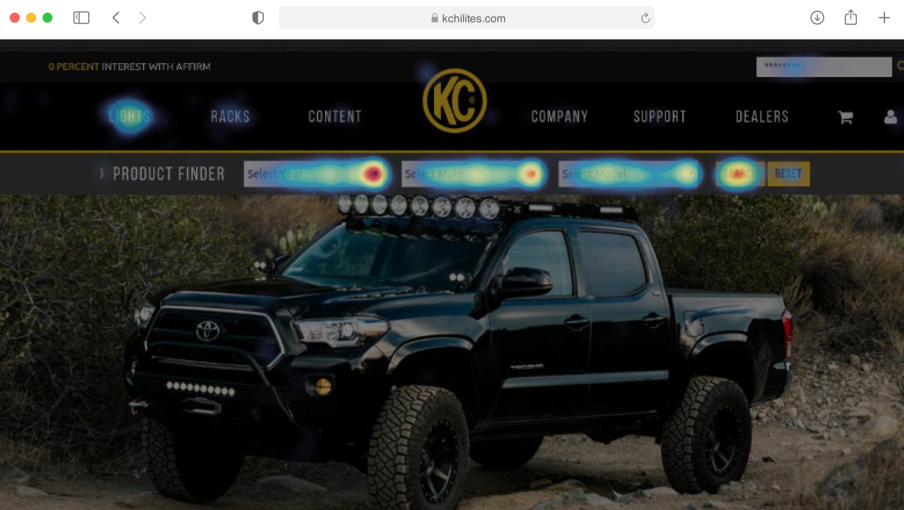
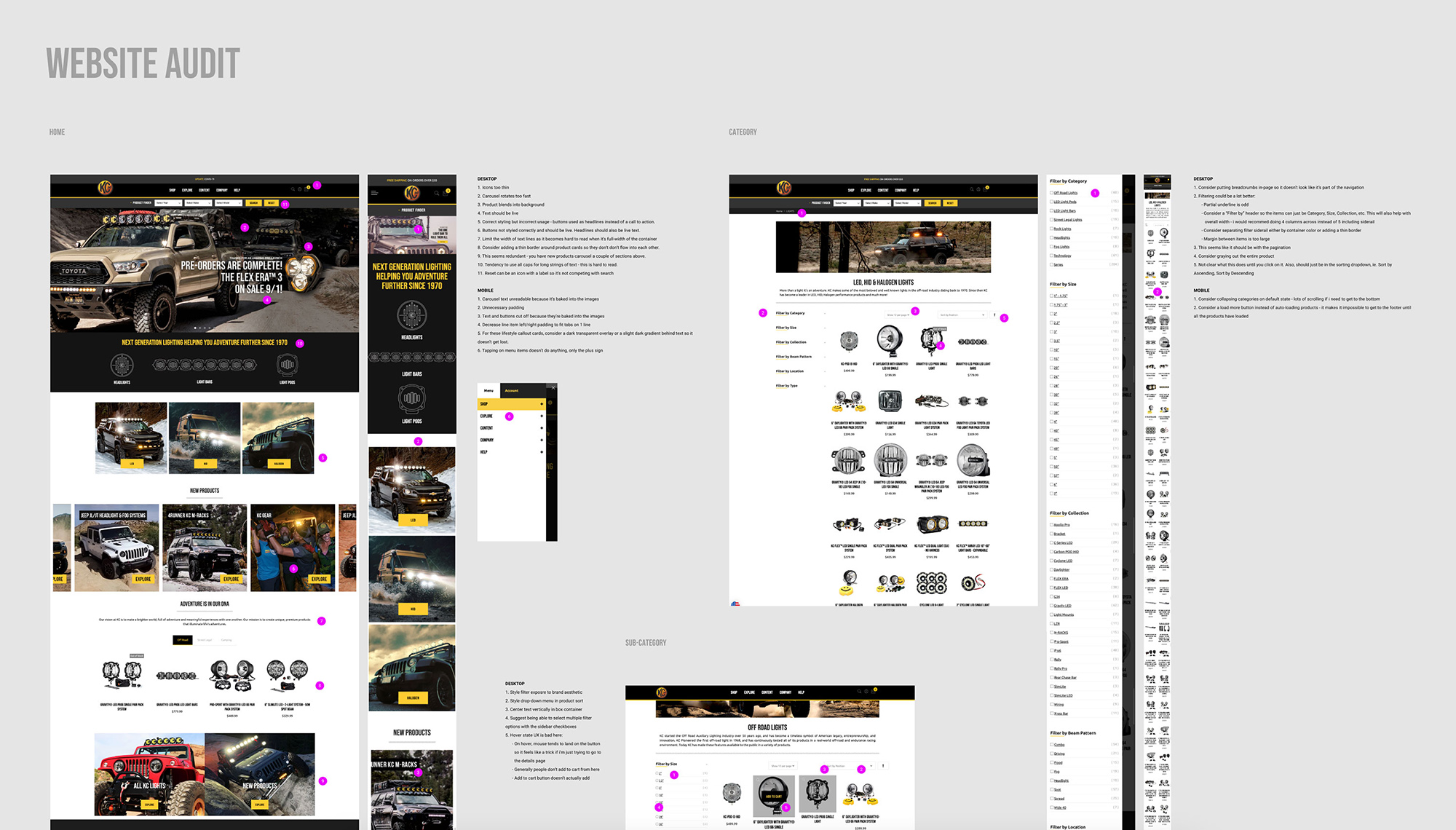
Hotjar research
Web audit Specs
Information Architecture

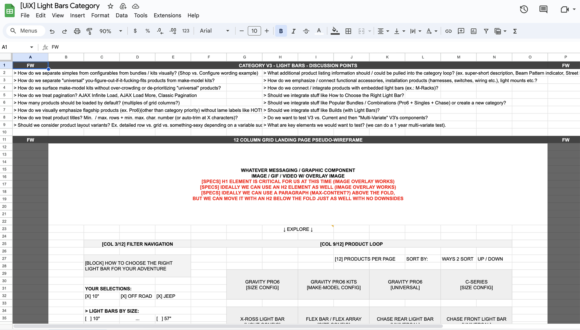
With hundreds of SKUs across multiple vehicle types, the existing navigation was sending users down the wrong paths.

We rebuilt the sitemap from scratch, grouping products around how customers actually think, not internal catalog logic. The new structure reduced navigation depth, surfaced the most popular categories at the top level, and treated vehicle compatibility as a first-class dimension.
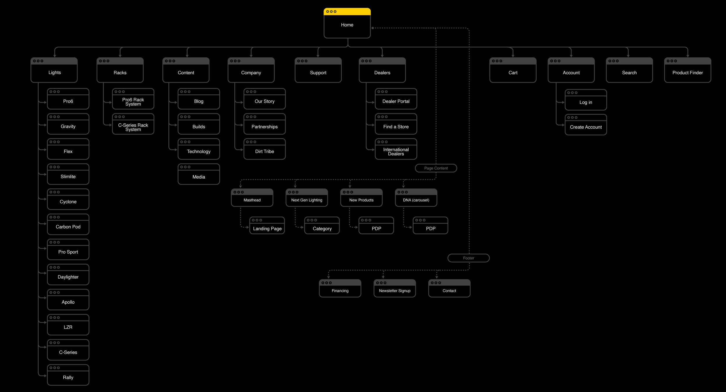
Sitemap
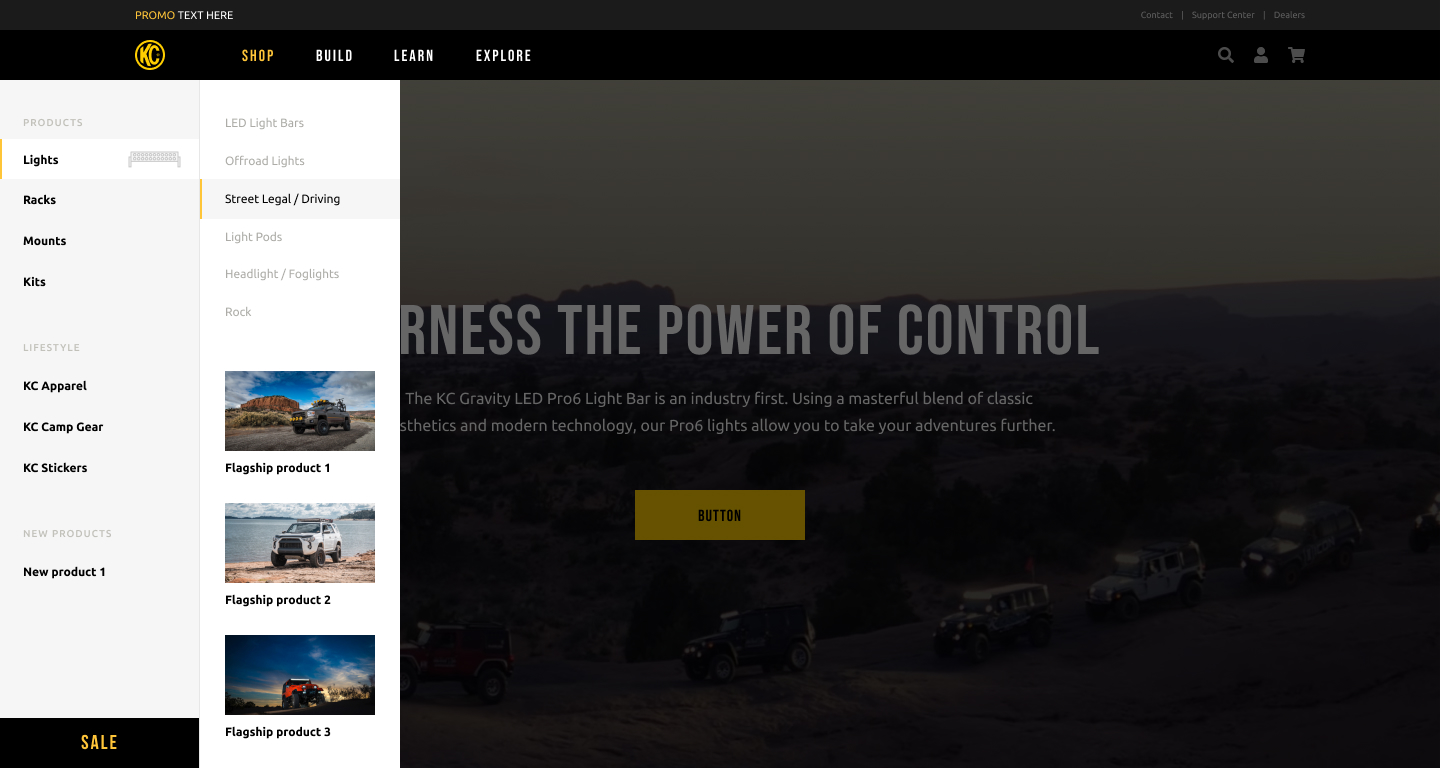
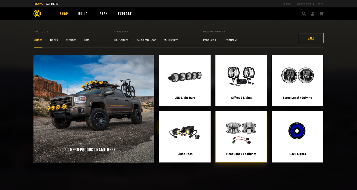
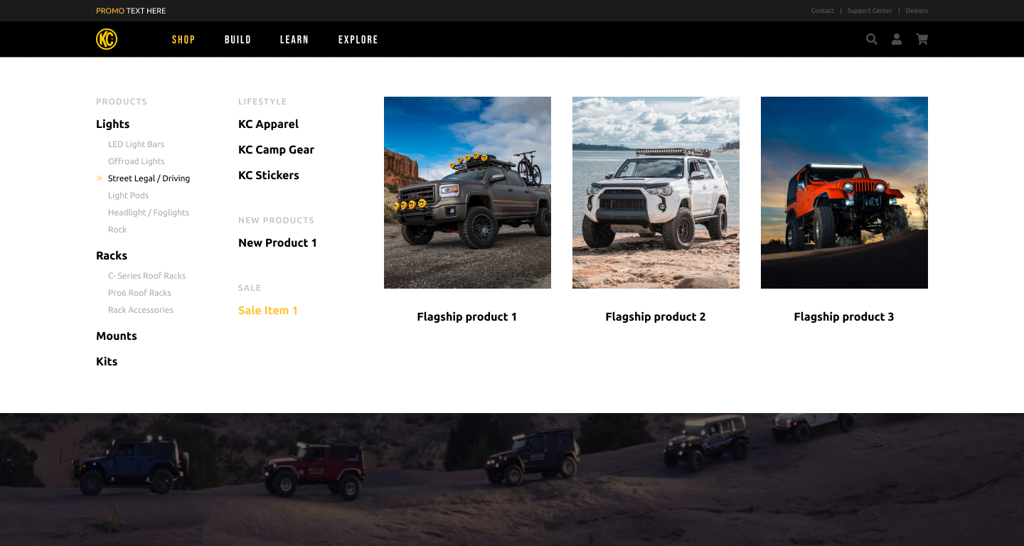
Navigation Concepts

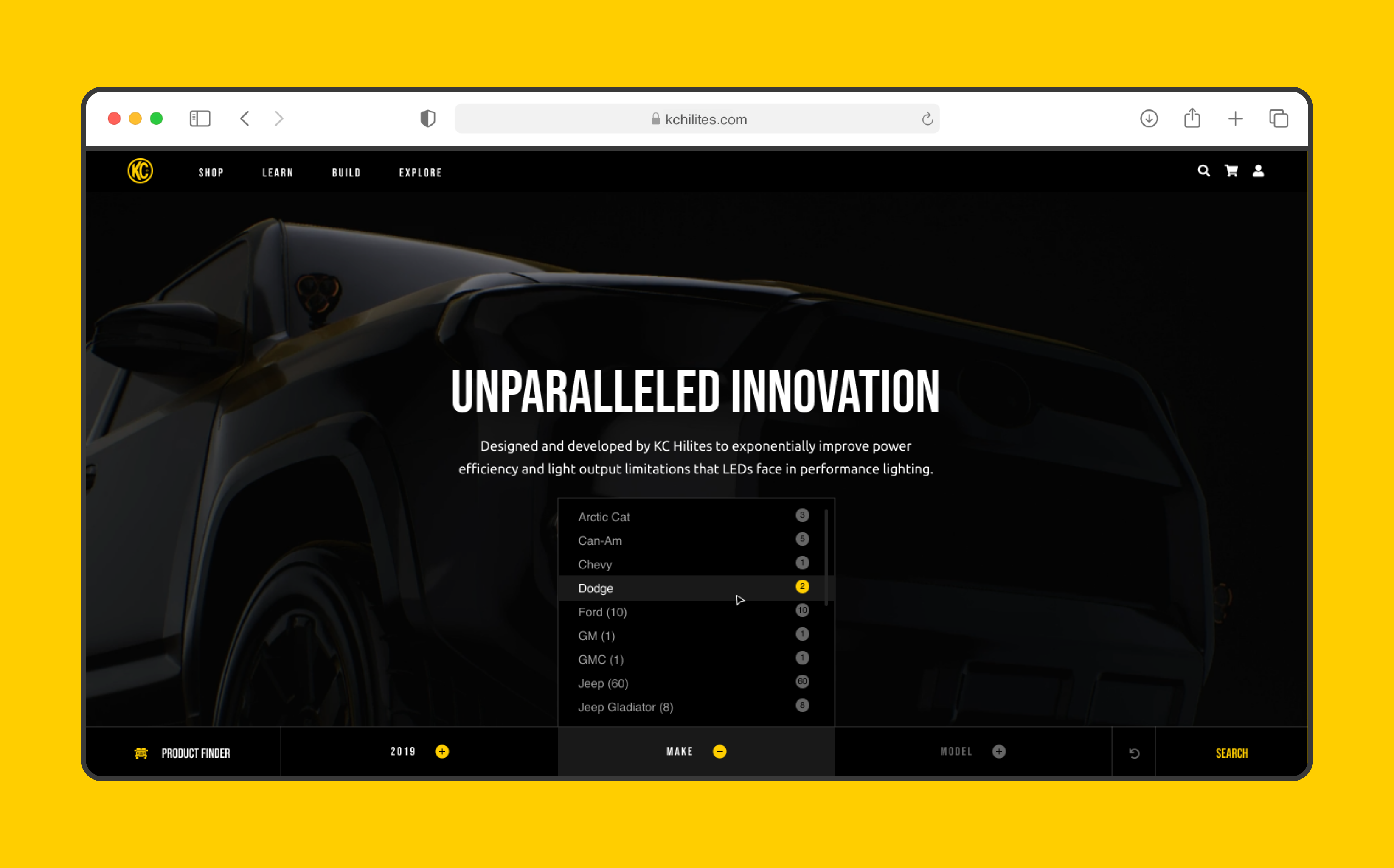
The new navigation needed to serve two distinct types of user: the casual browser and the off-roader who knows their part number.

Mega-menu panels with visual category previews serve the former. Persistent search with smart filtering serves the latter. A dark variant handles product-category landing pages where the photography demands it.
Product Pages

The old product pages buried the most important buying signals below the fold.

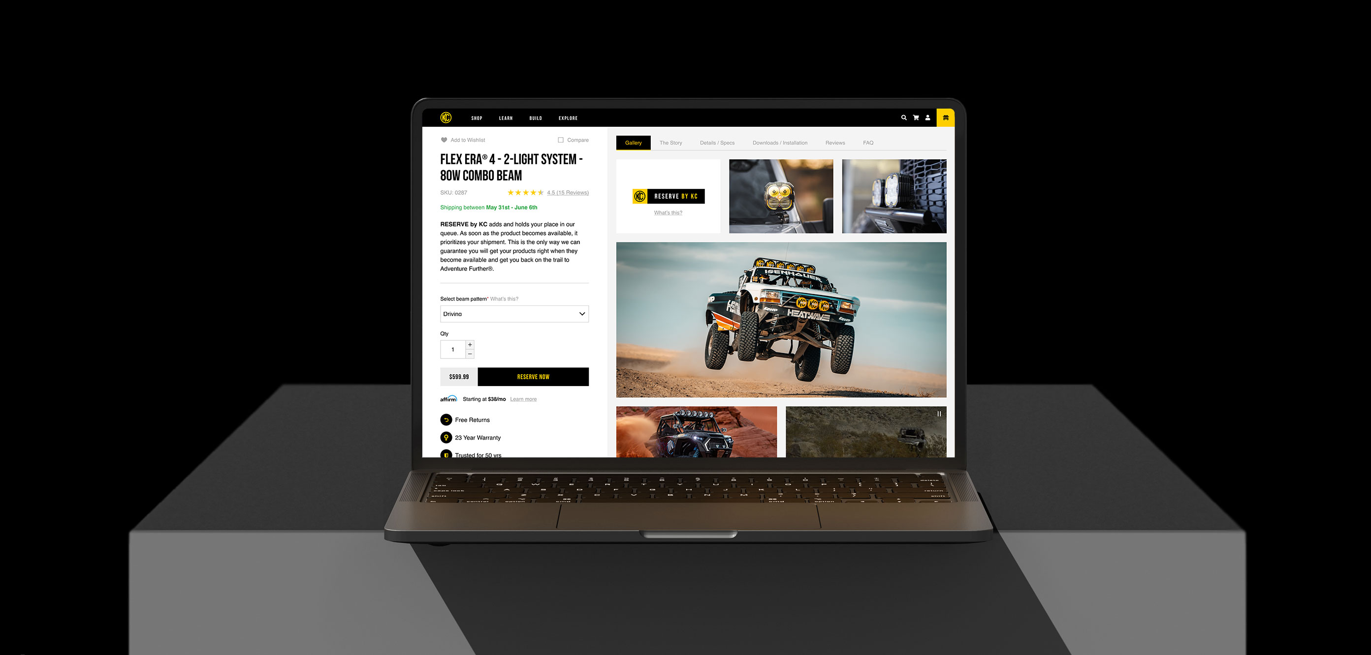
Redesigned PDPs lead with clarity: hero shot, model selector, and key specs above the fold. Compatibility information and related products follow a clear hierarchy that guides customers from interest to confidence to purchase.

Product detail page
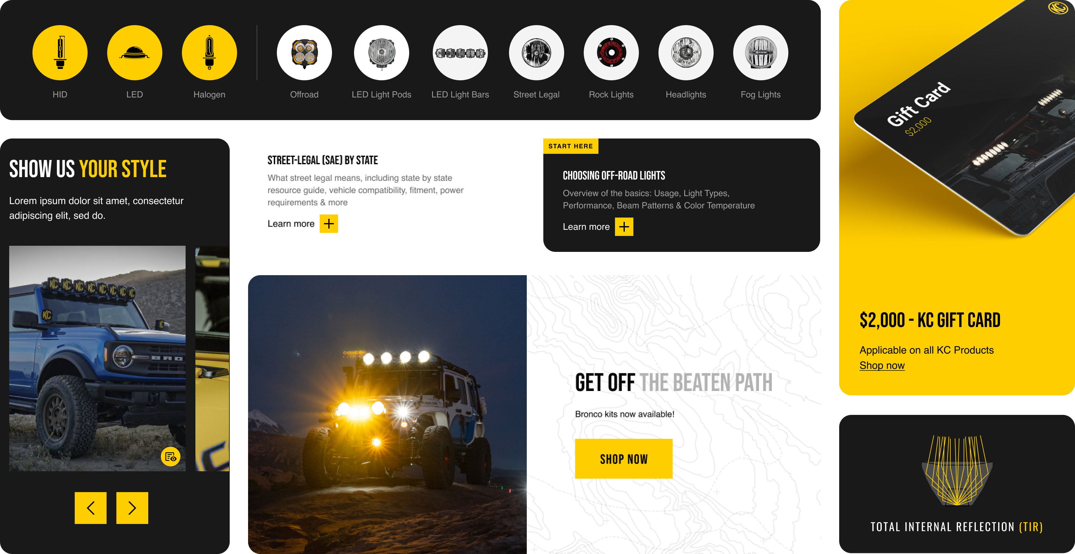
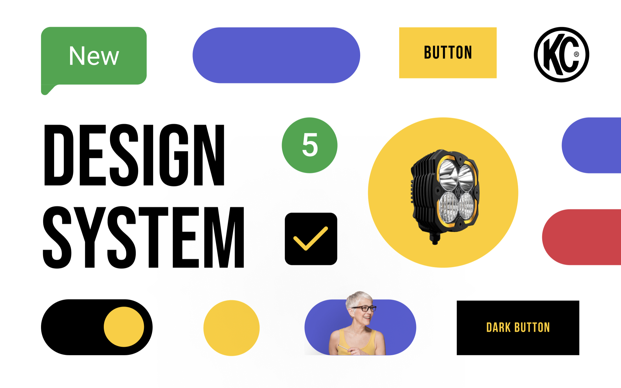
Design System

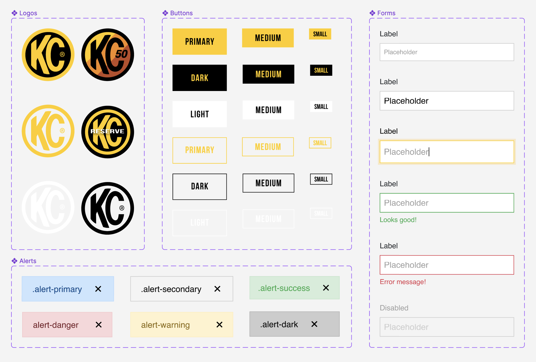
A redesign at this scale required a robust component library from the start.

Typography, color tokens, interactive states, product cards, navigation patterns, and form elements created a consistent foundation the development team could build from and extend.
Design system thumbnail Design system
UI elements
Icon set — outline Icon set — solid
How it comes together

Every touchpoint, designed to move customers from discovery to purchase with confidence.

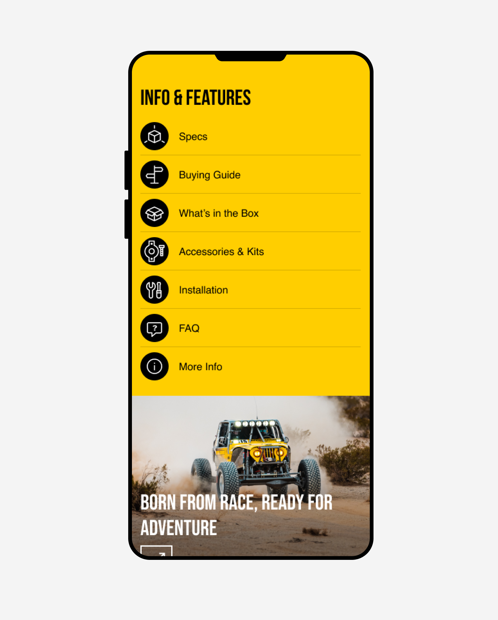
Product pages lead with clarity — hero shots, model selectors, and key specs above the fold, with compatibility information and related products following a hierarchy that guides from interest to purchase. Feature and spec pages give technical buyers the depth they need without burying casual browsers. On mobile, the experience was built with the same rigor as desktop: thumb-friendly navigation, swipeable galleries, and a checkout path designed around people actively working on their vehicles.
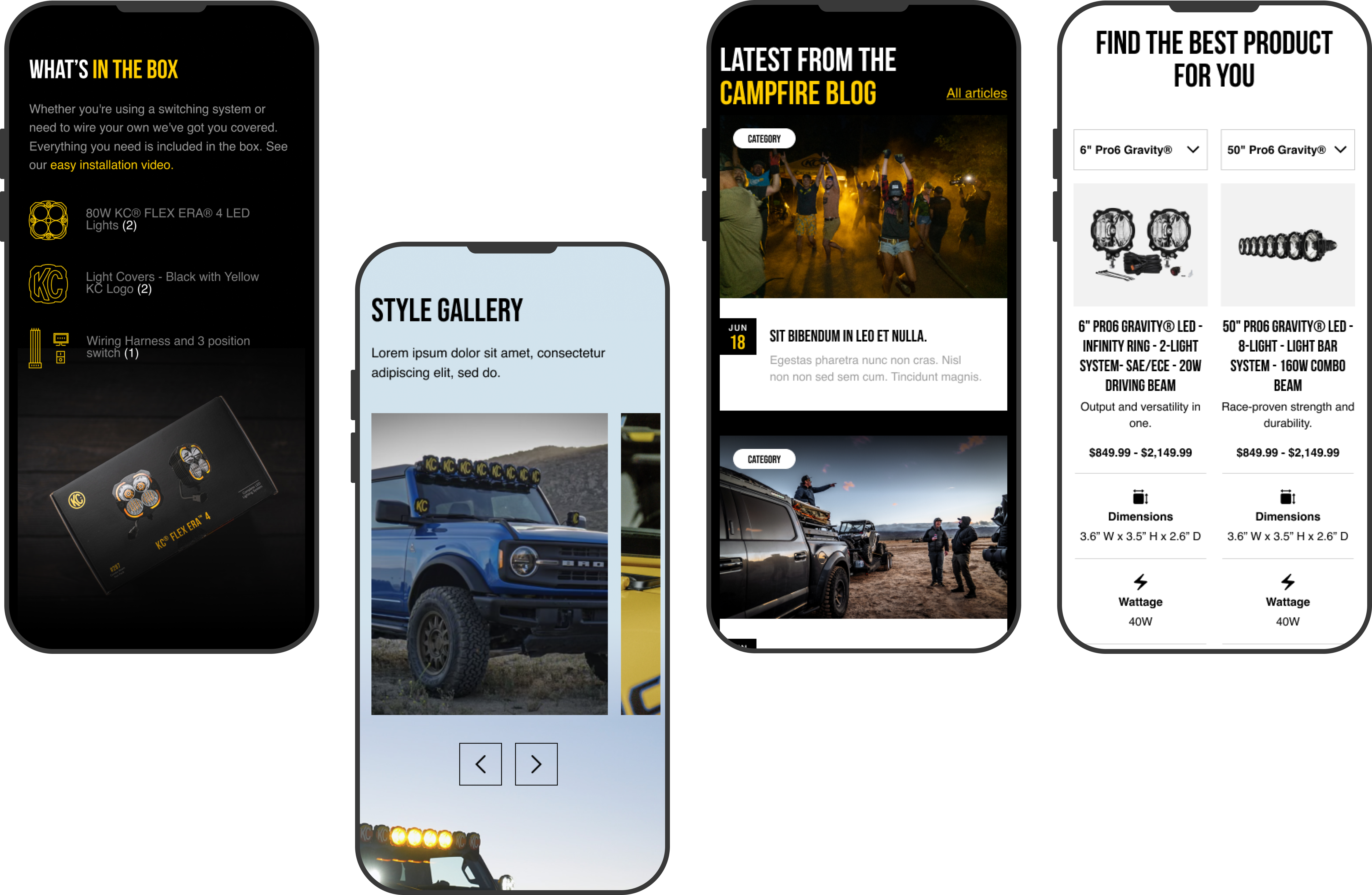
Mobile mockups
Group 465 Features mobile
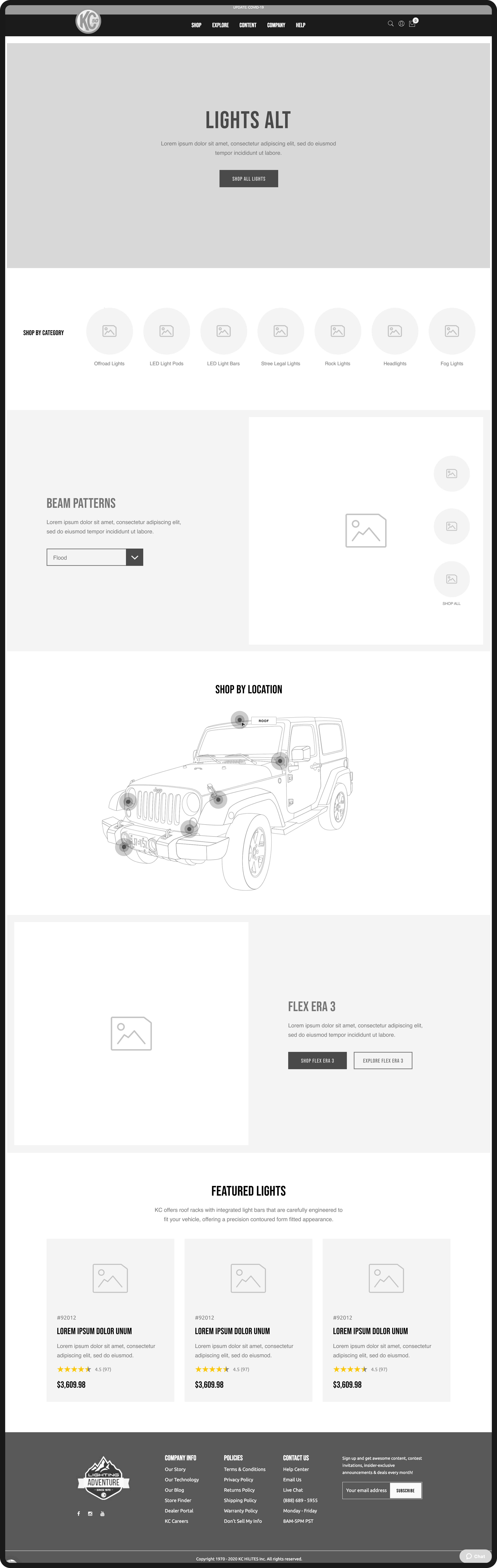
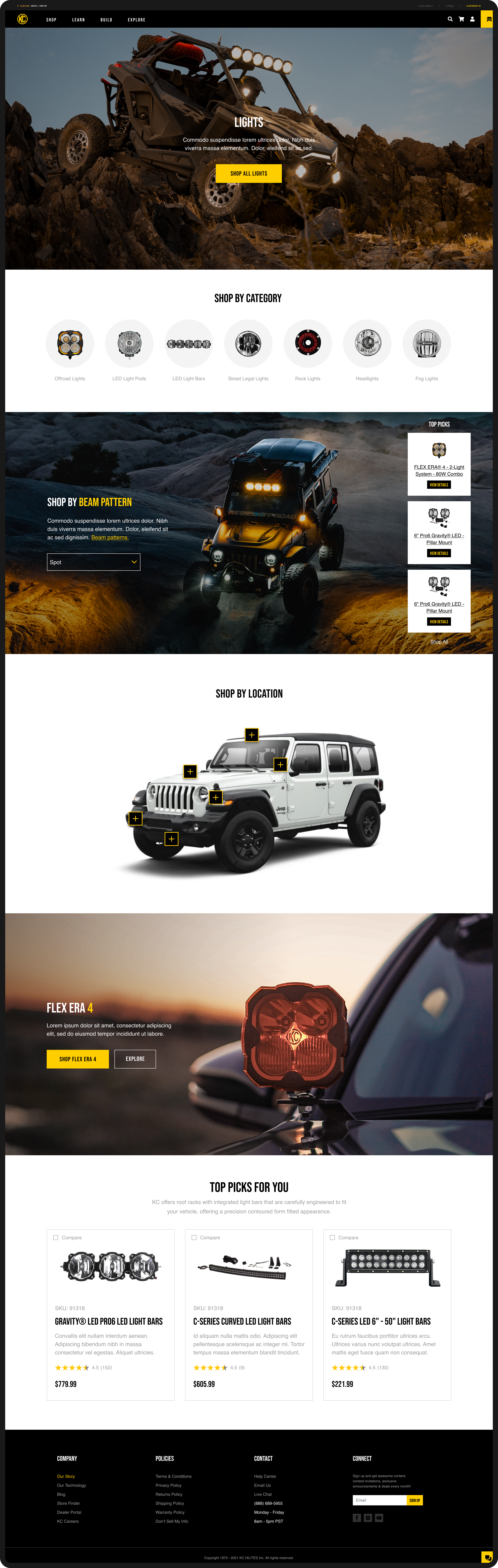
Lights wireframe Lights design
Product carousel
Product detail page
Nomadist
Next
Nomadist